Building a digital product is a highly involved iterative process that can bring improved value or new functional features to users, but unfortunately I’ve often been a part of teams that either don’t have time to conduct user testing or lack the budget to do so. Working under these common constraints, I’ve developed a testing model that can be adjusted to fit tight timelines and can be run relatively cost-free, because even the smallest amount of testing can help UXers preemptively identify usability issues and evaluate everything from low-fidelity concepts to fully fleshed out design prototype.
Planning for UX research
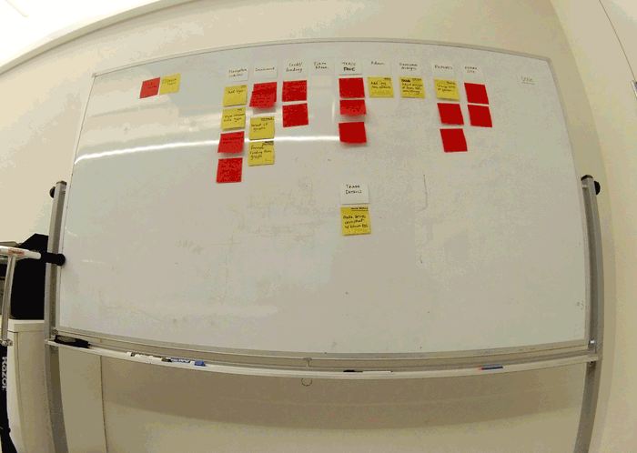
Whether working with design agencies or consulting with brands, I’ve commonly worked in 2-week design sprints. These sprints follow a predetermined set of activities and exercises, including activities related to validation and usability testing. Below is an example of how I structure my UX testing schedule. The diagram maps the key testing tasks across a 2-week design sprint. (Keep in mind, this design sprint would also include other tasks and meetings outside of this testing plan.) Based on how much time you have to work with, the research tasks can be adjusted and moved around to fit your team’s schedule and timelines.
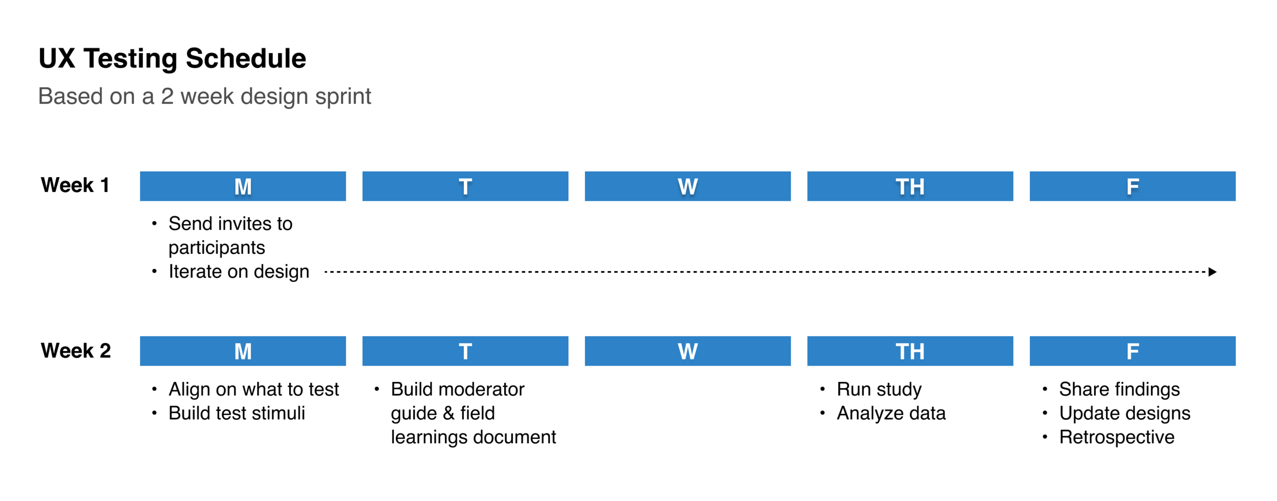
A simple testing schedule integrated into a 2 week design sprint. These key tasks can easily be adjusted to fit any form of design timeline.
Week 1 | Source & invite participants
At the beginning of the sprint, I take a look at our user base that we’re designing for (as this changes regularly based on the project). If possible, it’s beneficial to source real users of the product that you’ll be testing. Participants can often be sourced through client relationships or other company lists. It’s good practice to collaborate with the extended to understand how to best source these participants. Many times if sessions are 30 minutes or less, participants will offer their time for free, but offering a small gift card can also increase user participation. If you’re unable to use active product users, you can use 3rd party services to source participants (for a cost).
I typically source 8-9 participants, with the knowledge that there will usually always be 1-2 individuals that are unable to attend last minute. While this may seem like a relatively small sample size, it’s generally a good indicator of problems or gaps. 0 testers means 0 insights, so if truly limited by time or budget, push for testing on the most crucial areas.
For each testing session I assign a single facilitator and 1 silent notetaker. Having a few extra listeners present can also promote design transparency among business, engineering, and product constituents, but be mindful of including too many additional ears as this can sometimes be intimidating to participants.
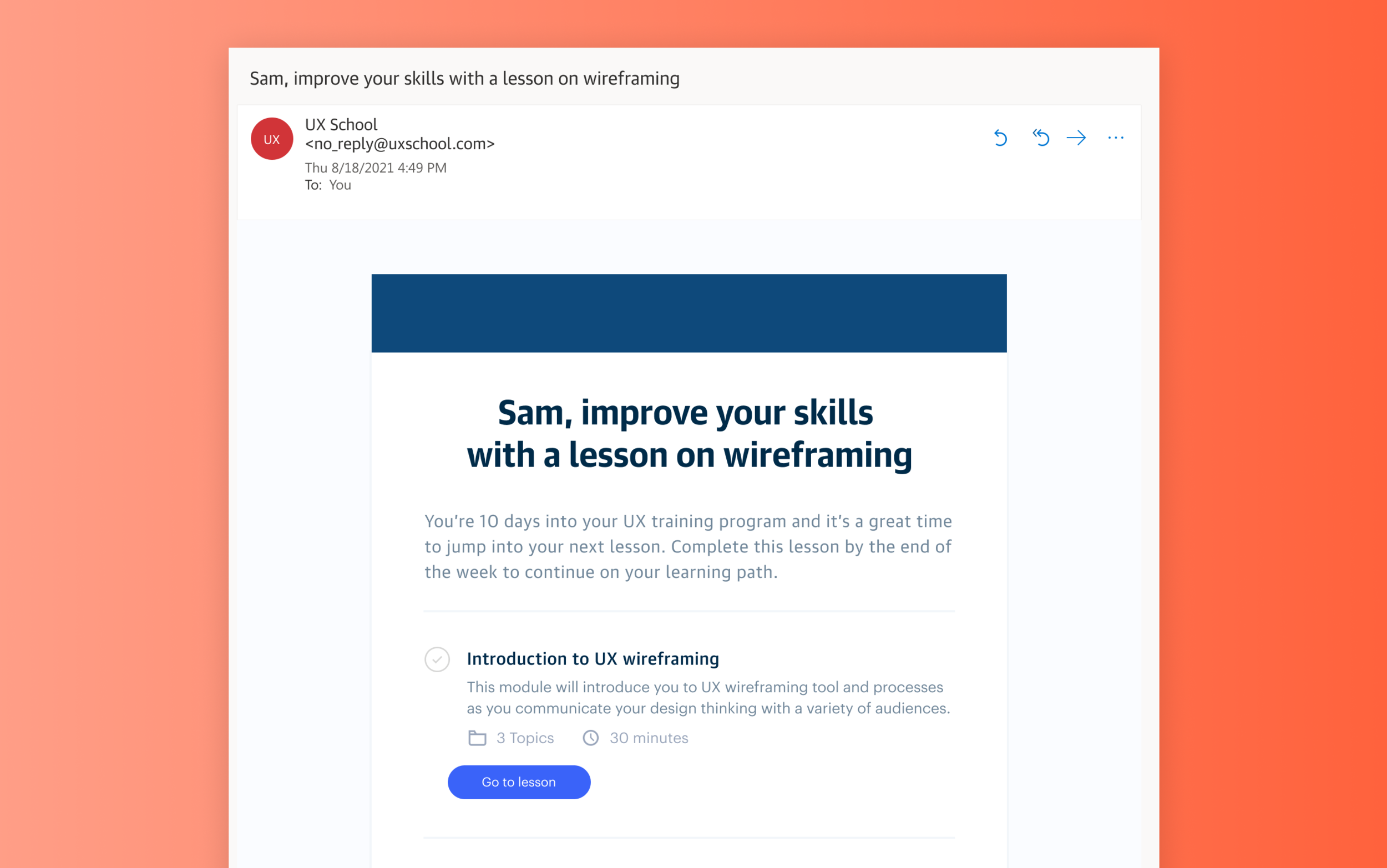
Below is an email template I’ve used to invite participants to testing studies. Using this as a base, the language can be adjusted to fit most validation scenarios. The invite is sent to the participant along with any the notetaker and listening-only attendee(s).

My invitation template sent to individual research participants.
The first week of the design sprint is then used primarily for design iterations–working with the cross-functional team on business requirements, engineering constraints, UX flows, prototypes, and mid-fidelity designs.
Week 2 (Monday) | Align on research objectives & build test stimuli
During the first week of the sprint I take notes during any design share outs to gather ideas for the testing sessions. These notes are my way of starting a conversation with the broader team.
As transparency is a strong value of mine, making sure that I’m able to share my testing ideas, as well as gather thoughts from the rest of the team, is crucial to not only building trust amongst the product team, but important in building a well-rounded end product.
During an alignment meeting with the product manager, we discuss key themes we’re curious about or questions we want to answer with the research. For example “expectation versus reality” is a common theme I often build tests around. Does the user expect something and is confused when it’s not what he expects? Other times we’ll have a more tactical usability test we want to run, such as “I want to understand if the user can make it from point A to point B without any missteps.” Research objectives are always project-specific and important to define and align on upfront.
With test objectives defined, the test stimuli can be built. Most recently I’ve been running remote user testing sessions by making pages in Figma specifically centered around the testing session. I place all the labeled design stimuli on that page (and later walk the testing participant through the stimuli while sharing my screen). Figma is also useful for sharing prototypes to validate usability or evaluate a more realistic interaction with screens and content.
While you will sometimes know the exact visuals, content, or flows you want to test, the stimuli creation work may sometimes overlap with the writing of the moderator guide, especially if this is a collaborative process with other team members.
Week 2 (Tuesday) | Build moderator guide & field learnings documents
The moderator guide and field learnings spreadsheet are two documents I use during the individual testing session–each with a specific purpose.
Moderator guide
A moderator guide is a document created to conduct a research session. The format and content of a moderator guide will vary depending on the type of test and how it’s being run. Because this guide may be shared across team members (and potentially outside the immediate team), this is the content I like to include in my moderator guide:
Test objectives & goals - It’s nice to re-surface these to keep them top of mind during the testing cycle. They’re the highest level themes that the qualitative (or quantitative) research data will help get answers to.
Facilitator/s - This is the individual or individuals that will be running the research session. This gives anyone viewing the document a point person to reach out to with questions about the study.
Audience - This is the specific user group that will be using the end product (and more specifically who will be the research participant).
Introduction - This is an overview that introduces the study and the format. I include project context, study timing, an introduction to other individuals who are listening in or taking notes, and a request to record the session. Before diving into the test session with the participant, I use this information to guide my introduction to the study participant.
Links to stimuli - These are any prototypes, designs/visuals, flows, etc. that will be used in the testing session. I link to my Figma design file for anyone who wants correlate the stimuli to the questions being asked.
Link to field learnings document - This is a spreadsheet built off of the moderator guide questions. Its primary use is to capture all the data during the research sessions for use during data analysis post testing. (More on this below)
Research questions - Grouping questions around a theme or stimuli can help structure a smooth session. I like to run semi-moderated sessions where I’m asking all the primary research questions. However, since this approach is a bit more loose, you’re not strictly tied to only asking the questions from the moderator guide. I often ask follow-up questions that go off script. This can allow you to get data that you may not have otherwise gotten if only sticking to the script.

My moderator guide template.
Field learnings spreadsheet
The field learning spreadsheet is a spreadsheet built off of the moderator guide questions and used to capture research data.
My spreadsheet is set up with 3 primary tabs:
Raw data - I add all of the research questions in the left-most vertical column and a vertical column to the right for each participant testing sessions. During the testing sessions, the notetaker uses this spreadsheet to input the qualitative (or quantitative) data. Setting the document up in this way allows my team to easily view data across a specific topic area or question. It helps us get a quick view into any themes that are appearing without having to do too much digging. Also included to the far right is a column to track insights. Jotting short notes in an insight column during the study makes it easier to create a quick roll-up report later.
Participants - This is a list of all the participants taking part in the study. It can include data such as their job role, location, contact details, or any other recruitment-specific information.
Insights report - This is a tab I use post study to build a report based on insights from the research. (More on this later)

My field learnings spreadsheet template.
Week 2 (Thursday) | Run the research study
After finalizing the tools used to run the research session, it’s time to jump into testing. I typically run all in-person (or remote) testing sessions on Thursday. Because this is near the end of the sprint, the team should feel confident in the designs being tested as they’ve gone through several internal product, engineering, and design team reviews before being shared with users.
Study Structure
I like to run shorter research sessions since we’re conducting them bi-weekly in our schedule. If you’re scheduling meetings back-to-back, it’s good to consider keeping the sessions to 25 minutes (or 55 minutes depending on how long you need with participants) as you’ll quickly learn that having those 5 extra minutes for a bio break (or to sneak in a snack) between sessions becomes necessary for session setup and remaining fully present during the testing sessions.
Pre-Testing
Do a dry run through of the test prior to the real sessions. This can help you catch last minute errors and make switching between stimuli and questions go much smoother. Iron out those kinks ahead of time!
Consider whether you will record the sessions. If you’re not transcribing word-for-word during the session, having a recording to reference later is beneficial to pull quotes from or to use as a visual/audio source to highlight during a share out presentation.
During Testing
Establish a positive rapport with participants. Instead of jumping right in to the study, consider asking participants how their day is going or if they’re planning anything fun for the weekend. It not only helps them open up, it also begins to build a foundation of trust. The ultimate goal is to make them feel comfortable enough to be open and honest with their responses during the study.
It’s OK to go off-script. The research questions are there as a guide and are beneficial to get answers to the same questions across users, but outside of that I always ask follow-up questions if the participant says something that brings up a new question that’s not in my guide. Sometimes these spur-of-the-moment detours can lead to unexpected “ah-ha!” insights.
Do quick check-ins with the notetakers and silent listeners to get a gauge on participants, themes that are arising, or interesting insights that are showing up. I like to do these after each session for a minute or two, if possible. It helps find areas that may be interesting to dig in to with the next participant.
Post Testing
It’s time for data analysis! With good notetakers, the spreadsheet will be full of juicy data points. Analysis can be done individually, but is best when there is some collaboration between all those who sat in on the sessions.

User testing sessions sharing a prototype with users over a Zoom video call.
Week 2 (Thursday) | Analyze the data
So there’s a spreadsheet of data. Now what? Time to go digging for gems! In my spreadsheet with the raw research data, I add 2 new columns: Highlights and Insights.
Highlights - Looking individually at questions posed, across all participants, I use this column to highlight interesting participant-specific comments. Sometimes there will be other questions that help add support these highlights, which I also call out. If there are any powerful quotes, I’ll include them here for reference later.
Insights - Based on all of the qualitative (and/or quantitate) data from the research, I develop insights, or new understandings of what was tested that guide actionable recommendations. (It’s important to also note that recommendations aren’t only limited to the UX as they may extend to content, engineering, or business rules.)

Field learnings spreadsheet including research highlights and insights, across a specific topic/question.
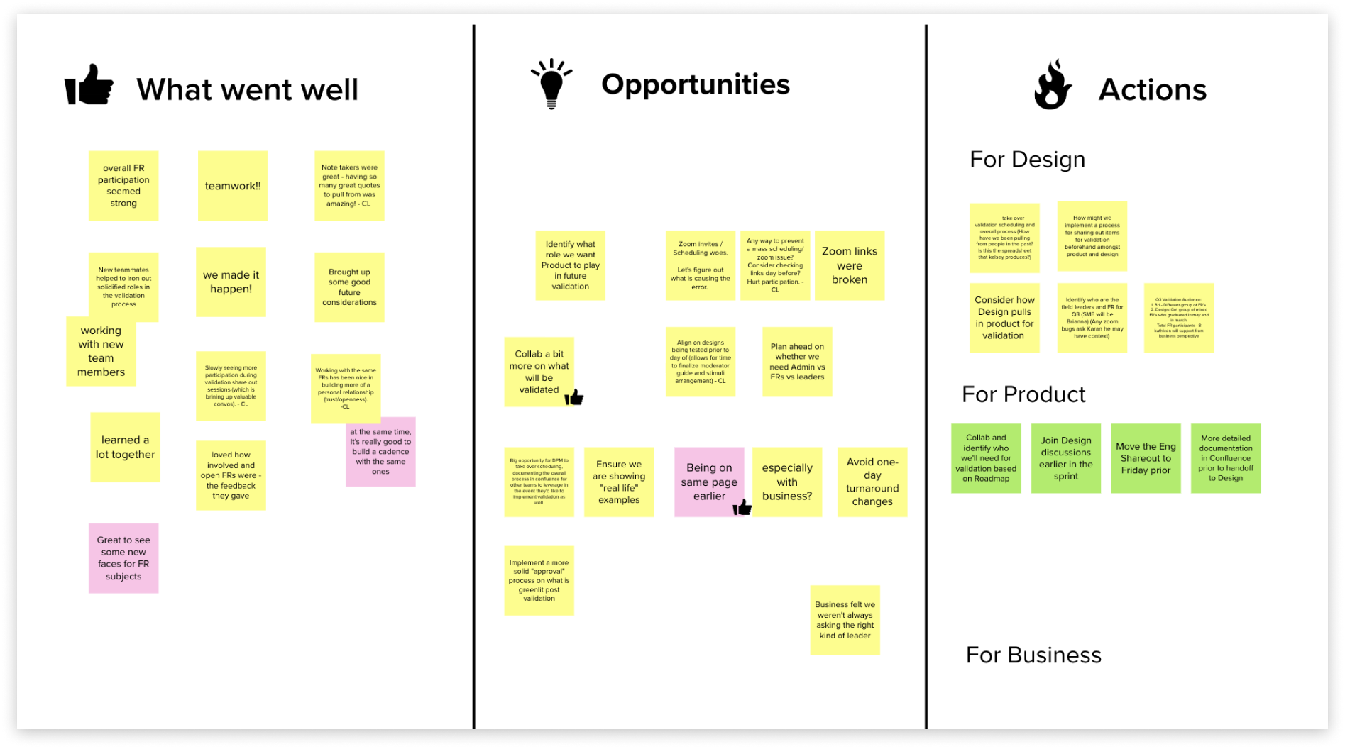
Another tool I’ve used to analyze data is a product call Mural, a digital workspace for visual collaboration. Similar to my spreadsheet setup, data can be collected on digital sticky-notes and moved around and grouped to identify themes. In my experience, I’ve found taking notes in a spreadsheet during a testing session is more efficient than creating individual post-it notes in Mural. But, as Mural is visually flexible and easy to collaborate in, it’s preferred by some designers.

Mural document visualizing research data.
In my field learnings spreadsheet, I use my Insights Report tab to build a “down and dirty” findings report to share with my cross-functional team. Since I run testing sessions bi-weekly, I tend to spend less time on creating a fancy presentation when the key stakeholders are primarily concerned with our next steps based on the data. I use this report to guide a collaborative conversation about the product and how to proceed forward.
While this spreadsheet is often times my final report deliverable, it’s important to build a report based on your audience and their needs. Sometimes a bit more design love is needed. I often find this is the case when I’m presenting to higher level business partners. But even with limited effort and time, pulling together some key insights to share in a 30 minute presentation can be extremely powerful.

Insight report tab in field learnings spreadsheet.
Because my report is built for a broad range of product partners (engineering, product, business, and design) my format includes both contextual testing information as well as the key findings and next steps. These are the primary sections I include in my research reports:
Testing overview & goals - Because this report is shared with a broad audience (and potentially outside of my in-person presentation), it’s beneficial to include the primary testing objectives and goals that the team aligned on at the beginning of the sprint.
Methodology - This is the framework used to setup the research study. I include the type of study and session length, the number of participants we scheduled and how many actually showed up, the research facilitators and notetakers, how the research was conducted (via Zoom, in person, etc.), and the type of tests that were done (prototype testing, card sorting, design analysis, etc.). This information, along with the testing objectives and goals, provides valuable background context to ground the reader or listener.
Insights & themes (typically 5-7) - This is the meat and potatoes of the report. Based on the insights identified in the raw data, I pull out primary themes. Depending on the project and research, this may be a very broad theme or a rather narrow one. Each theme is expanded upon through the identification of our hypothesis and assumptions followed by the research insights. Including supporting quotes, video clips, and/or quantitative numbers from the research will make the story of the data much more compelling.
Next steps - Based on the insights, next steps contextualize where the the team can make actionable improvements to the product or design. While I contribute a starting point for next steps, and knowing some next step may fall outside of UX, this initial list helps open up the conversation for the extended team to play an active role in collaborating on next step-specifics.
Week 2 (Friday) | Share Findings & update designs
After the output report is finalized, it gets shared on the last day of the design sprint. As part of a design sprint, I have a reoccurring meeting on the calendar for business partners, products managers, engineers, designers, and anyone who’s interested in listening in on what was tested and the outcomes.
Over a Zoom call, I walk through the detailed report, using the overview to set the stage for the key insights content. Pulling in supporting content such as design visuals tested or screen recordings from the research sessions provides color to a simple spreadsheet presentation. A pause after each theme presented allows for a brief discussion around the topic and the opportunity to align on next steps, collaboratively. These next steps guide changes that need to be executed on the UX and visual design as well as other areas outside of design.
Depending on the complexity of the updates, follow-up meetings may need to be scheduled and/or the work may require an extra day to be delivered, but in most cases, if testing is a part of the regular sprint routine, updates can usually be quick turn-arounds and delivered the same day or the following Monday.
Week 2 (Friday) | Testing retrospective
To close the testing loop, the team regroups on the last Friday of the sprint for a retrospective (specifically focused on testing). A retro meeting is a discussion with the extended product team, with the primary goal of improving future sprints. I use the meeting to explore what went well during the current sprint, areas that can be improved upon (opportunities), and any individual actions we want to take during the next sprint.
A UX retrospective board the team collaborated on in Mural.
Because this is a collaborative meeting where all individuals who participated in the sprint should be participating (business, product, engineering, design, etc.), we use Mural, a low-cost online tool that is easily accessible by all members. Mural allows us to create a simple 3 column layout with our categories: What Went Well, Opportunities, and Actions.
Over a Zoom meeting, everyone is given 5 minutes to write digital post-its with their thoughts on the first category, What Went Well. Topics considered should span the entire testing process–participant sourcing and scheduling, resource allocation, communication, documentation, user testing or reporting. At the 5 minute mark, a member of the team reads aloud all the post-its. The same process is continued for the Opportunities category. It’s a healthy practice to allow time for discussion on topics, specifically around areas that can use improvement. If a discussion is going too deep, it’s an indicator that there may be a need for a separate discussion. These topics can be parking lotted and addressed as a next step (meeting) in order to continue with the retro.

UX research retrospective held over Zoom ever design sprint.
If retros are a new concept to your team, it may take a bit to get into a well-oiled groove. Having a routine retro cadence can provide the time and space for participants to grow into being more open and transparent with their feedback. With the support of organizers and managers making meetings a “safe space” to share, retros can become one of the most beneficial meetings of the sprint. These collaborative meetings and discussions are crucial in surfacing the root causes of issues so they can be mitigated in future sprints. And, not only does this practice improve team dynamics, processes, productivity, and outputs, it helps reinforce things that are already working for the team.
Week 2 (Friday) | Design handoff
I’ve made it through testing. 💪
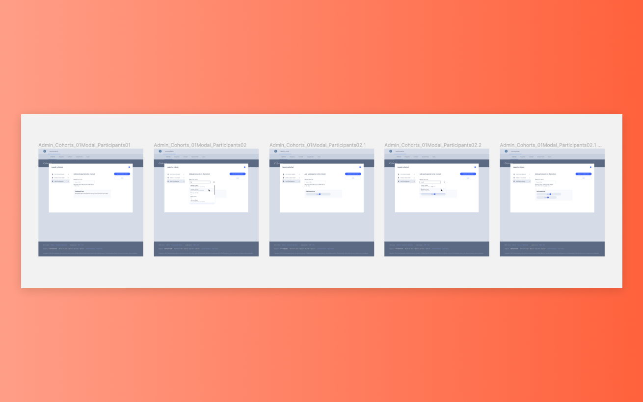
If I was running validation testing with the ultimate goal of handing over design work to the engineering team, this is the last task of the week. After making final design adjustments coming out of the research share out, I package my designs in Figma. A “Handoff” page is created in the file and light annotations are included to call out key UI or interactions (that have also been discussed in weekly meetings). In some cases if I was working with a prototype, I’d have a final page for the Prototype and include a title page that would include direct links to key parts of the user flow(s). This gives the engineers the option to view the flat screens (like below) or to navigate the lightweight prototype.

A page is created in the Figma file for the final design handoff screens (and light annotations).
And to tie the sprint up with a pretty little red bow, I craft a Slack message detailing the finished design work and share this with the extended team (product, engineering, and design).

How I share design files via Slack with the product and engineering team.
While there is some amount of effort and time needed to incorporate UX research into a design process, you can always find ways to make it work within your constraints, whether that be time, resourcing, or budget. Even the smallest amount of validation in a project can bring value to the greater team and product. Happy researching!
I’d love to hear from you!
I hope the overview of my UX research process can provide you some insight into one way of incorporating UX into a product team. I know my way certainly isn’t the only way, so I’d love to hear from you!
How does your team integrate UX research?
Do you have a set process or tools that work for you and your team?
What are your biggest challenges in integrating UX research?