


Google Apps Script
Work
Google Apps Script
Work
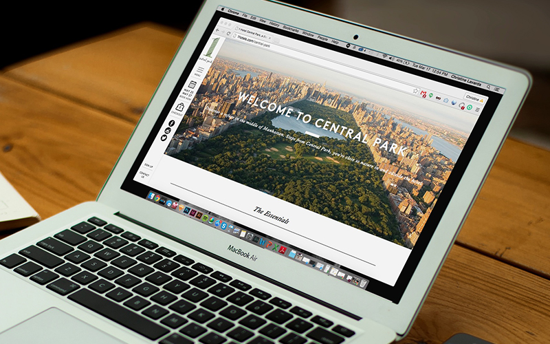
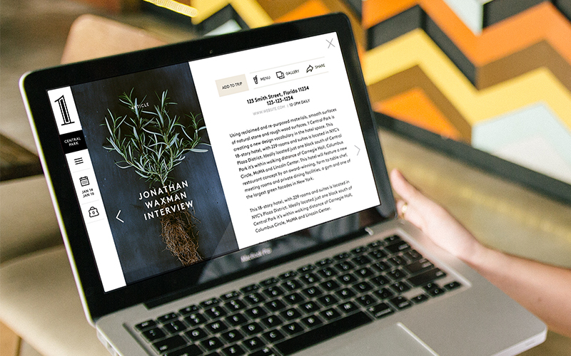
Google Apps Script Enhance & Scale

Project Enhance and scale Google Apps Script
Role User Experience Designer (UXD) at Google (Cloud/G Suite)
Product
Google Apps Script is a development platform for creating business applications that integrate with, automate and extend Google Cloud’s G Suite. Apps Script exists to empower user productivity.
Team Structure
As part of a small agile team, I partnered with 11 offsite engineers, a product manager, a senior UX researcher, and a senior UX designer.
Primary goals
The UX goals of the project focused on two primary areas:
update legacy product UI and user flows to match current Google Material Design standards
research, recommend, and execute on identified areas of opportunity for the product (based on gaps, target customer base, and project timeline)
Timeline
The project kicked off in early September 2019 and we were given a 4 month timeline that included on-boarding, execution, handoffs, and holidays. We scoped the UX work into two parallel tracks, one lead by UX design, the other by our UX researcher.
During our on-boarding phase, we worked with our engineering team and product manager to explore the product in depth by holding deep dives and Q&A sessions. After gaining an understanding of the existing product, primary task flows, the target audience, and technical constraints, we structured our UX timeline .

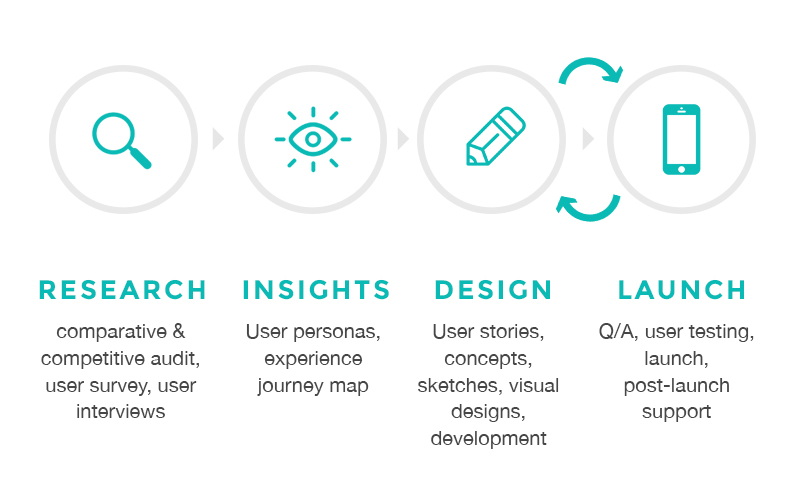
Design Process
Inside of Google, each team has the ability to shape their process as they see best fits their needs. As user experience designers, our primary goal was to improve customer satisfaction, engagement, and retention through the increased utility, improved ease of use, and enjoyment through the interaction with our product. So, we implemented a new process on the team that would help us best identify and solve problems through a gained empathy for our users.

Foundation phase
- What are key user behaviors, mindsets, pain points and opportunities?
- How do those user behaviors map to the brand and product goals?Definition phase
- What does the experience need to deliver across a journey within the various ecosystem touch points?
- What are our immediate priorities to pursue vs. long-term priorities?Design execution phase
- How does the journey come to life for the user?
Foundation
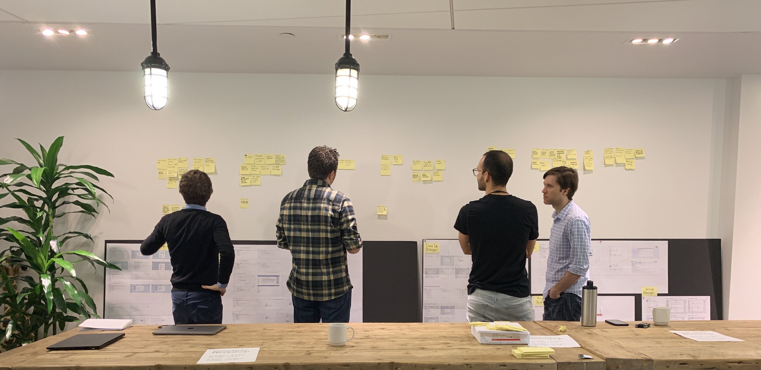
Workshop exploring critical user journeys (journey phases, pain points, gaps and opportunities, and desired outcomes of each phase)
Through a foundational heuristic evaluation of Apps Script, we identified several themes.
Lack of guidance and context
Deployment fragmentation - Deployment presented many entry points and deployment options with no guidance on how deploy or where deployment details live later
Debugging - There was a lack of communication around setting breakpoints and how to manage them
Manifest file - The manifest file, used to manage settings within code, was located outside of the files list, causing confusion surrounding how to locate it or hide it
Dead end flows
Managing libraries - Without knowing a library’s exact ID, adding one was nearly impossible for the target user
Locating prior deployments - Post deployment, knowing where to locate all past deployments was not clear to users
Missing features & functionality
Version management & comparison - Unlike other editors, Apps Script was missing the ability to easily compare the head version to a prior version or understand how to revert it
Debugging - There was a lack of proper column typings and information to help users understand what to do next
Inconsistent usability patterns
Opening projects in Apps Script - While clicking files within Google Drive opens the file to edit, in Apps Script clicking a file opens a project details page which was unexpected to users
Save file vs. save all - “Save” functionality in Apps Script saves a single file in the project, whereas save in other Google Editors (Docs, Sheets, Slides, etc.) saves the entire file, creating inconsistencies and unexpected results

A heuristics evaluation surfaced several key themes–giving us multiple areas to explore more extensively through research and analysis.
Definition
One of our primary goals for Apps Script was to update the existing UI to bring the product up to new Google UI standards. But the learnings from our foundational phase pointed to many new areas we could explore in the next release.
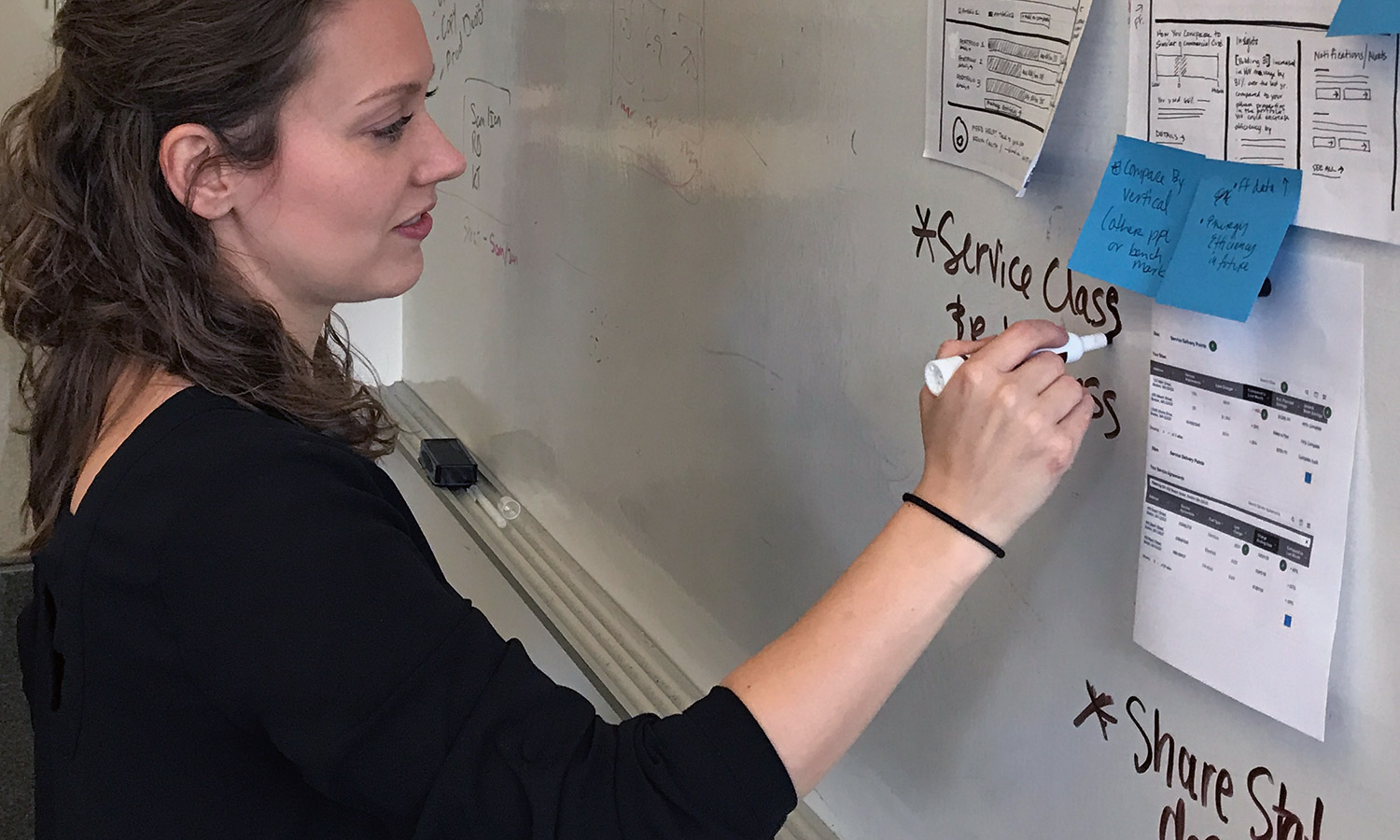
Rather than UX defining the future of the product, we invited the extended team in to play an important role in the product design process. Without the technical thinking and business voice, we couldn’t build a working solution that fit within our product timeline. Through workshops and sketching sessions, all team members were able to contribute their ideas of potential solutions–solving key opportunity gaps we identified during our foundation phase.

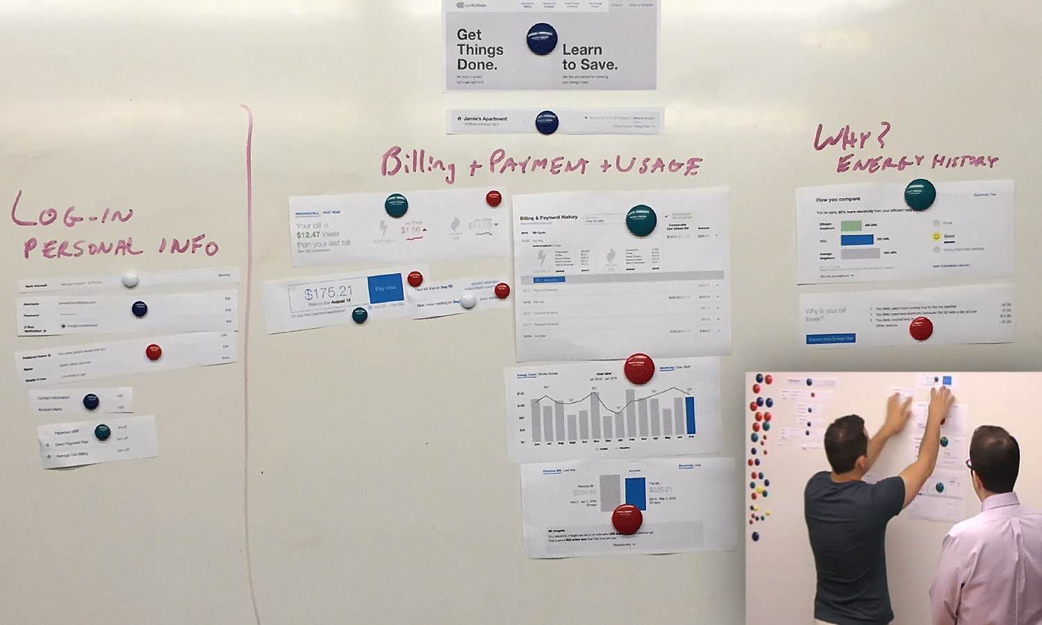
Sketching solutions to pain points and opportunity areas
By inviting the extended team in to our design process, we increased advocacy for our user-centered processes and generated a wider array of solutions for us to assess from our respective disciplines.

Mapping engineering effort, user impact, and business value
From the sketches, we noted all of the unique features. As teams, we assessed and scored features from an engineering, business value, and user impact perspective. The features were mapped to visualize the most feasible. For those solutions we were not able to implement in this track of work, we created a backlog of opportunity areas the team could explore post launch.
Design Execution
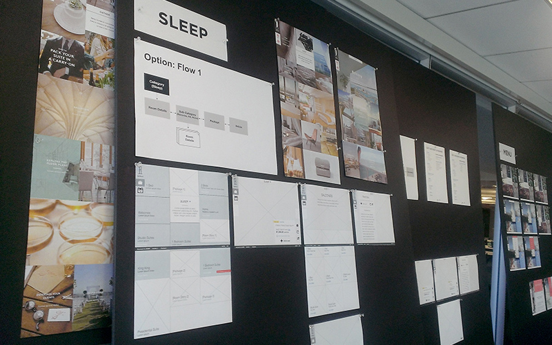
As we headed into the execution phase of the project, my UX design partner and I implemented an agile working structure. We set up 2-week sprints that consisted of:
Day 1: Sprint kick-off meeting to hold a retrospective of how the prior sprint went (what went well, what could be improved upon, and changes to take into the new sprint), plan the specific areas/features/problems UX would be addressing over the course of the next 2 weeks, and review the relevant portion of the Product Mangers’s Product Requirements Document (PRD)
Day 3, 5, 10, 12: Design reviews were design-focused meetings to discuss business logic and finalize technical requirements, and share sketches, task flows, digital wireframes, or prototypes to garner feedback
Final day of sprint: UX asset handoff were all final assets (annotated wireframes, PNG assets, prototypes, etc.) were presented and delivered to the engineering team
Prior to our first sprint, the team prioritized what features and flows to address for each sprint. Our agile process allowed us to re-adjust when we ran into complexities and needed extra time but also allowed us to pull in additional tasks if we had left over time during the sprint.
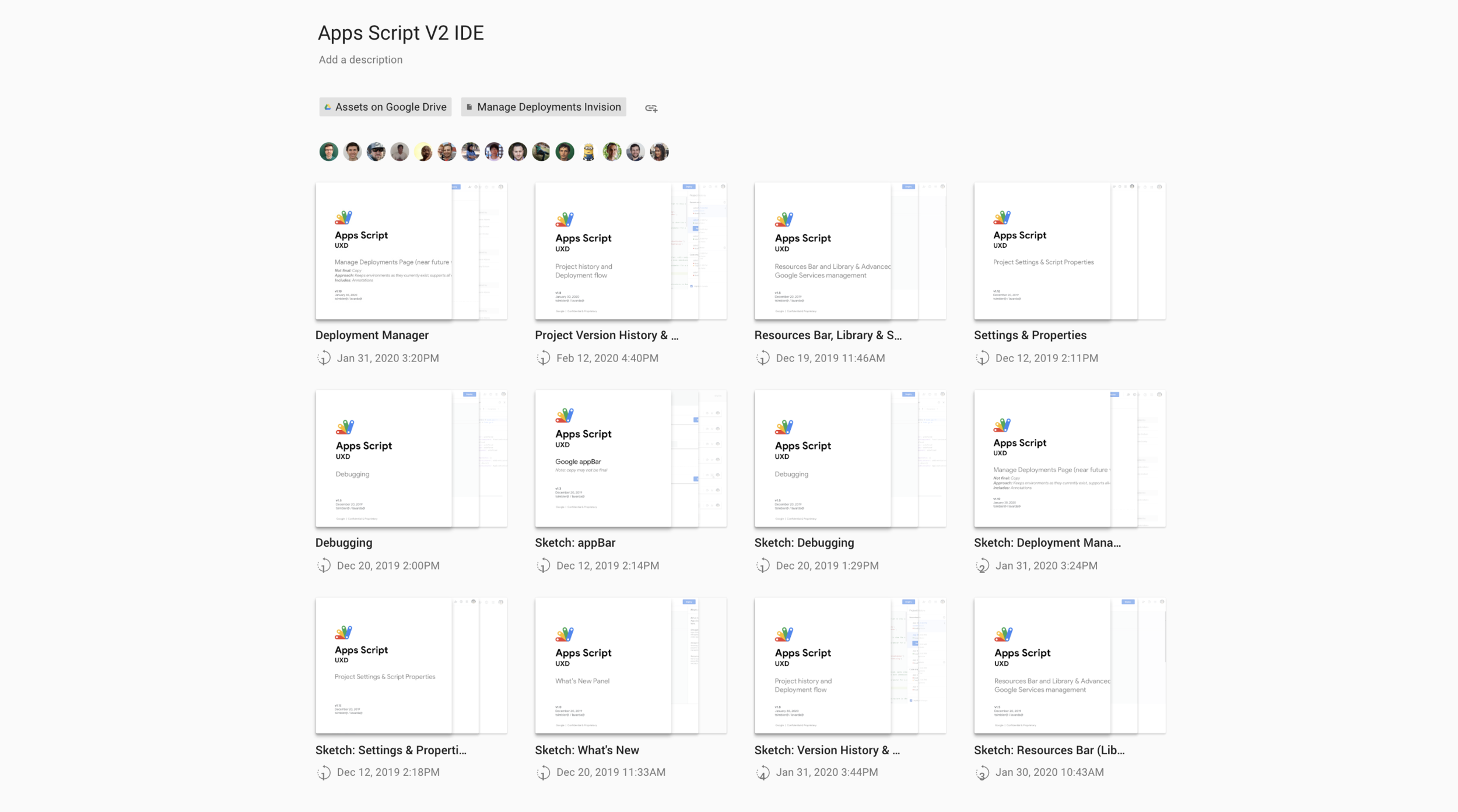
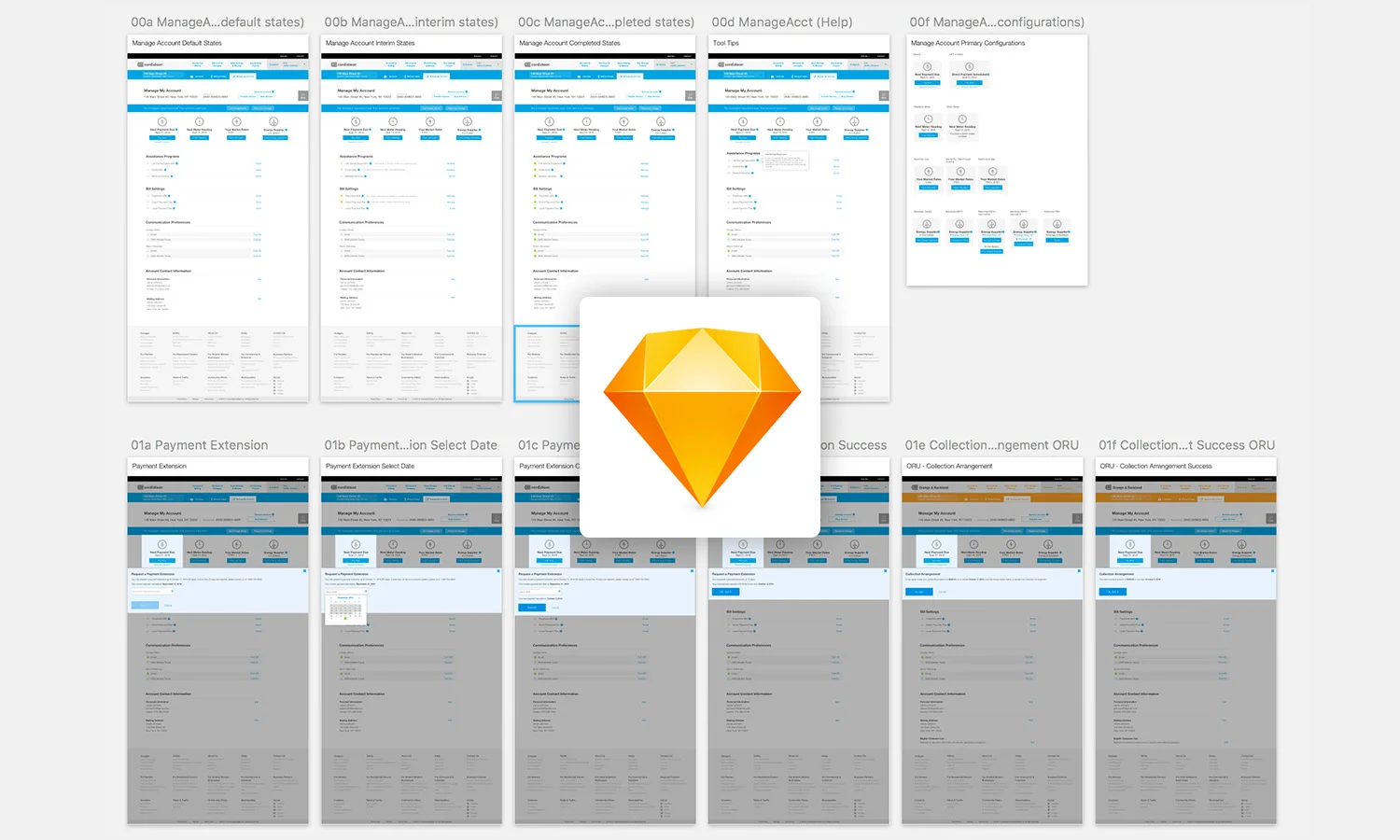
Wireframes (Sketch, Gallery) and interactive prototypes (Invision) were reviewed as a team several times throughout the sprint.

Working through digital and printed flows and functionality via iterative design reviews
Key Product Outcomes
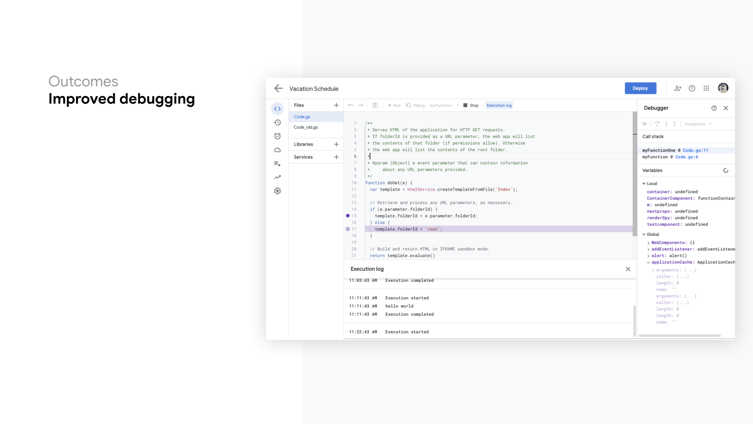
Improved debugging experience: Compared to other industry debugging experiences, Apps Script was lagging. Breakpoint hints were added to improve discoverability, font and spacing were adjusted in the execution log to aid scan-ability, and the variables panel was re-architected to the right of the script editor to make locating values easier, provide contextual controls, and give users more room to reference code.
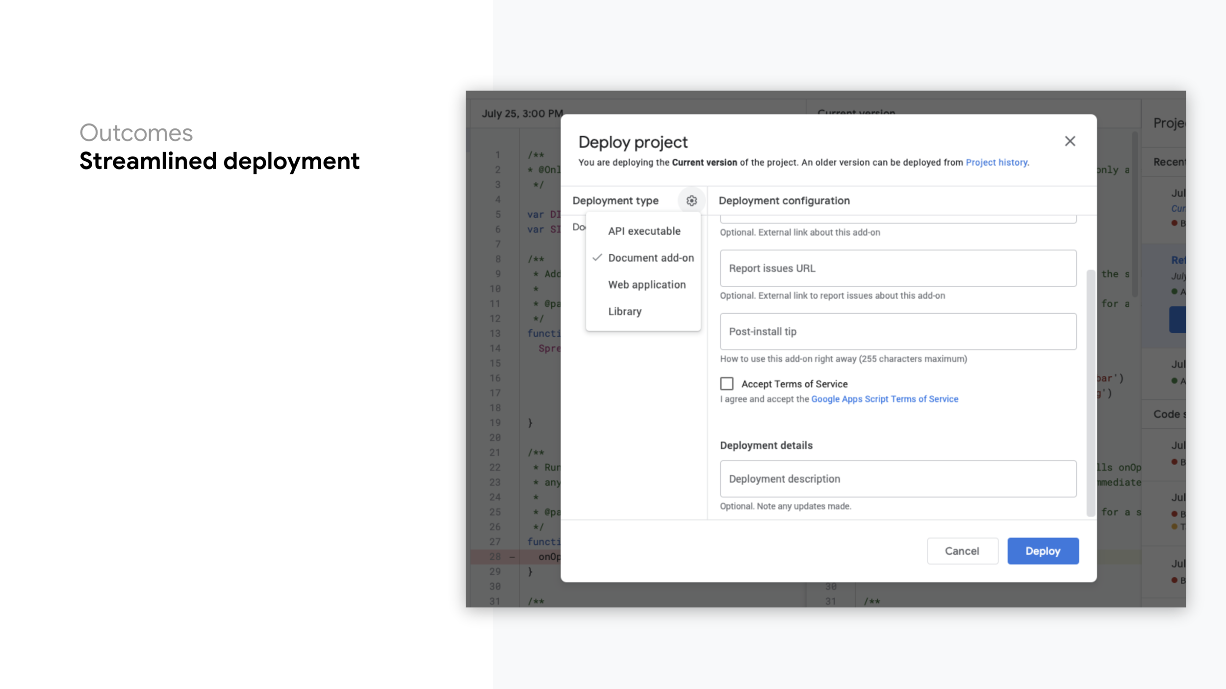
Streamlined deployment: The deployment flow was fragmented and dispersed throughout many unique entry points and flows. We improved the experience by auto-suggesting the type of deployment and cutting down the number of steps in the process, ultimately reducing the barrier to deploy a project. Language and directions were optimized to increase clarity. At the time of deployment, we added a saved “snapshot” of source code, or version, which the user is able to revert to within their project history.
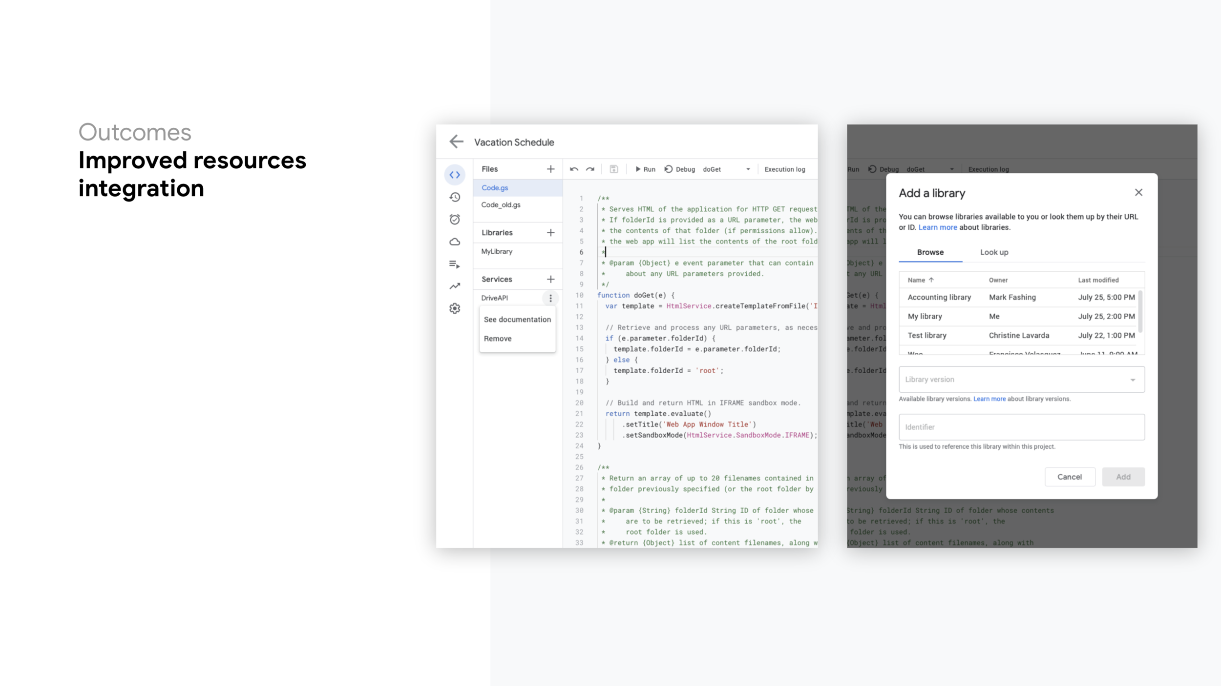
Improved resources integration: The files (resources) panel was expanded to not only include project files, but also libraries and services. New UI was added to inform users when resources are unavailable, deleted or removed, added, or when there are new versions available. Integrating these new elements will help users add and manage project resources from a single location.
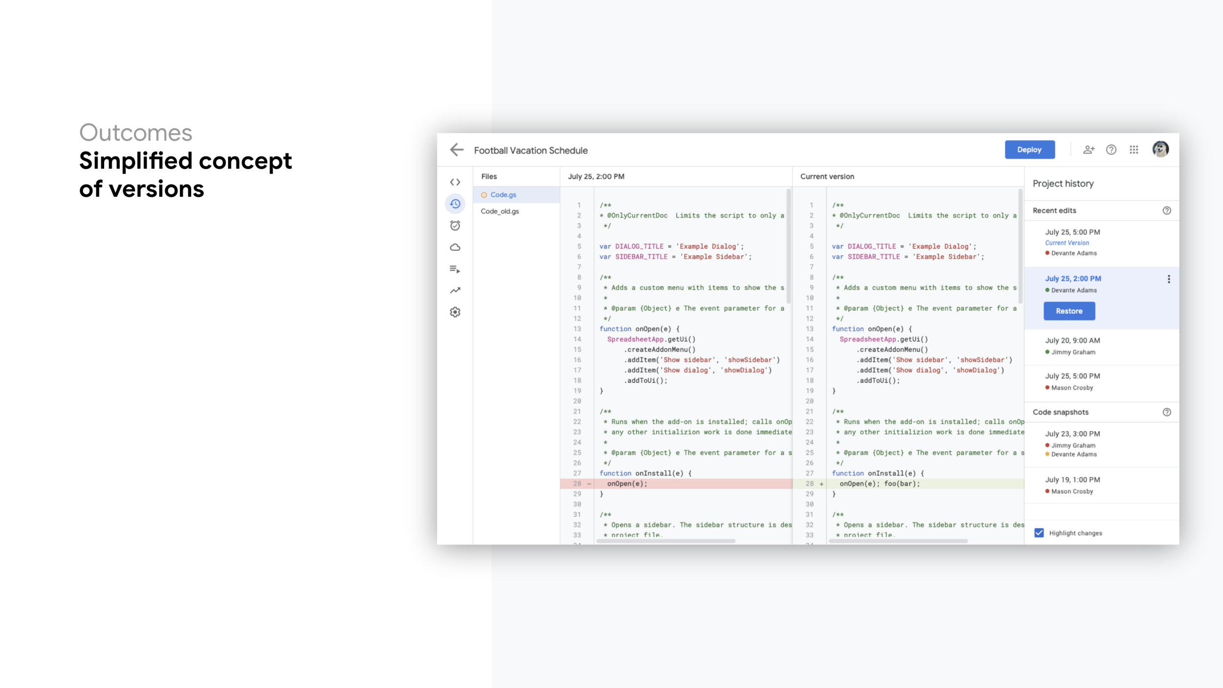
Simplified concept of versions: Apps Script had multiple types of versioning that weren’t completely clear to users. By leveraging an existing version pattern established in other Google editor products (e.g., Docs, Sheets, Slides etc.), versions were consolidated and simplified. Now, using a new Project History page, users are able to compare their project to a prior saved version or deployment snapshot and easily roll it back if needed. The version comparison tool optimizes the ability to quickly highlight code differences between the current version and a past version.
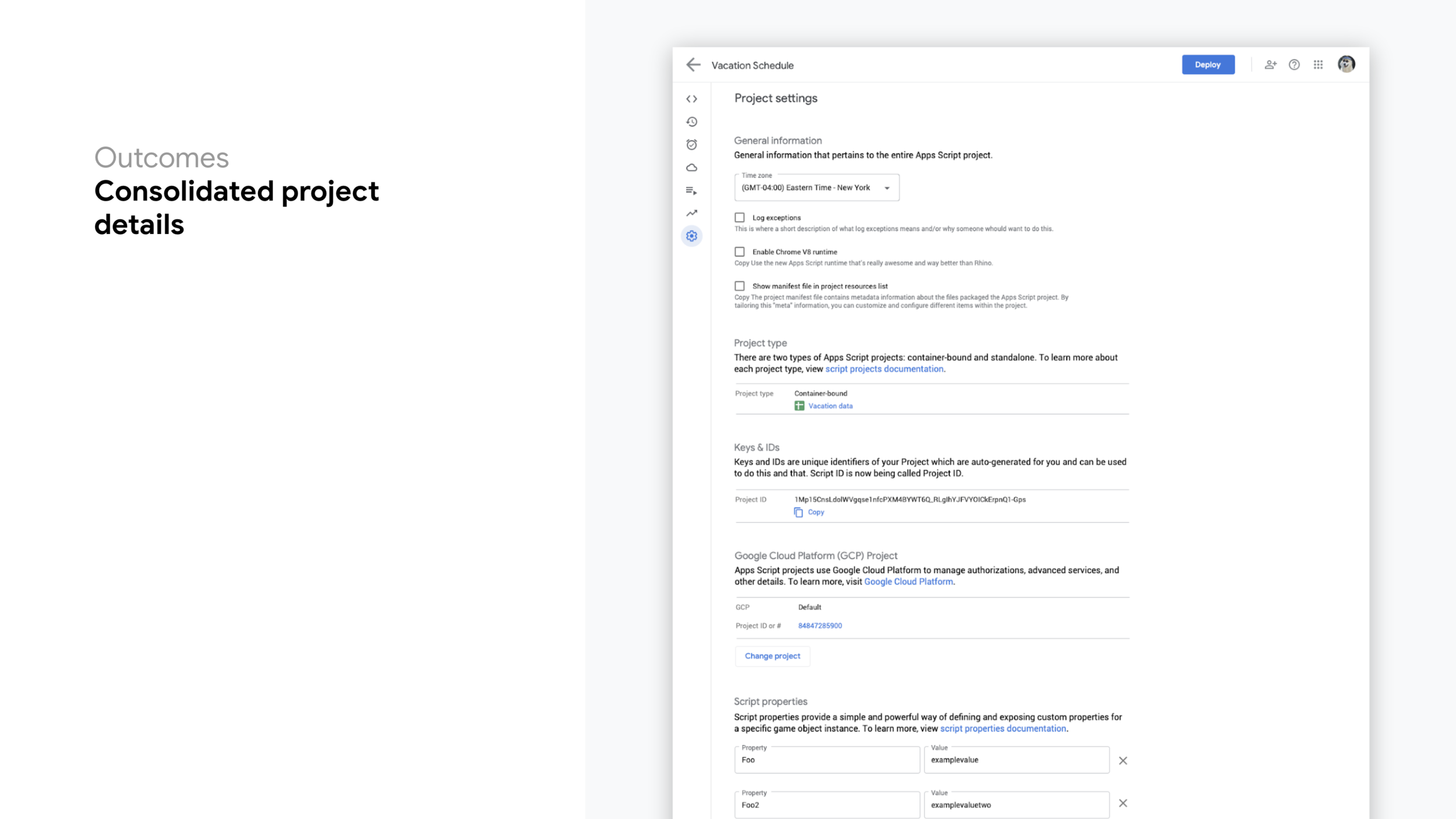
Consolidated project details: Project settings and properties, are now consolidated to a single page per project–easily accessible via a single location. This new page has been added to the secondary navigational links to promote find-ability.
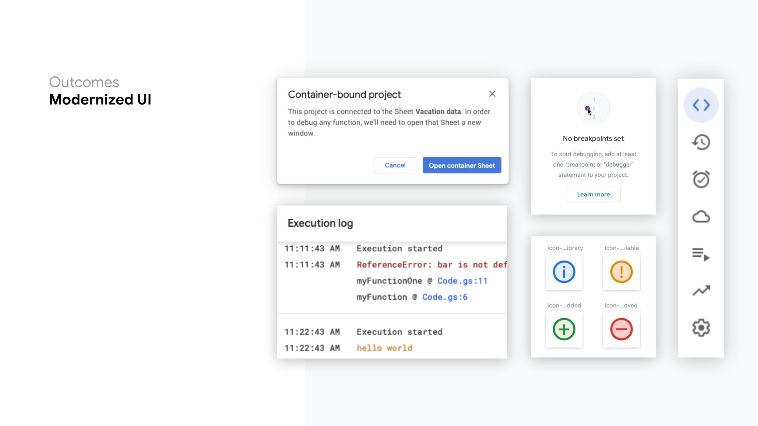
Modernized UI: Because the IDE was built before Google’s Material Design was implemented, we modernized the look and feel of the editor–taking inspiration from the latest Google UI. We’ve updated dialogs, buttons, fonts, input fields, and layouts. These improvements help Apps Script feel more inline with Google standards and better integrated with other G Suite products.
Project Reflections & Learnings
Working in sprints allowed us to time-box design work and measure our velocity. We could easily adjust our workload to accommodate more work or more time, depending on what we learned along the way.
Holding retrospectives helped us to not just continuously improve our product designs, but also how we were designing the product. It also was a space for us to explore new ways of working together as a team and the tools we were using to best facilitate and communicate our ideas.
Finding a good balance between solo and collaborative modes was as important as it was to define each team member’s majors and minor roles for each of the project phases.
Prototypes and user flows are worth a 1,000 mocks. Sometimes communicating complex user flows and interactions was difficult through a set of static wireframes. Quickly stringing some visuals together in an online clickable prototype truly helped convey complicated use cases and user flows.
Our amazing engineering team had minimal experience working with designers, so we wanted to make sure we were able to collectively work together to build the best product. We adjusted our working structure to allow for additional time to educate them on design processes and new ways of working together to always have a customer-centric approach. Our presentations and design workshops were constant reminders on what/whys we were doing certain tasks.
Apps Script had no initial metrics. Having no baseline metrics to measure the success of the changes you implement is extremely difficult. We were strong advocates for including instrumentation and metrics in product releases going forward. And in the meantime, we used our experience and knowledge as skill practitioners to recommend the best UX approaches. Our post launch plan included usability testing to find any lingering issues.
Project Successes
Updated Apps Script product will be featured at Google Cloud Next 2020. There has been a lot of enthusiasm surrounding the improved product, and it has been noticed by the entire organization–featuring a session on it this year’s NEXT conference San Francisco.
Positive feedback from Google Developer Experts. In a multi-hour session, we introduced our improved product, and the thinking behind our work, to some of the most important users of the product, those who teach others how to use it. The positive reactions and eagerness to learn more about the thinking behind the work inspired our team to continue their hard work and investment in the product.
Implemented an agile working processes with the team. With minimal UX design or research involvement in the past, the engineering team and PM team was a bit hesitant to change their working structure or try any new processes. But after a couple sprints, they found benefits in processes like structured timelines, sprint retrospectives, and design handoffs.
A positive learning experience for both engineers and UX design team. We have noticed engineers holding similar design-style workshops with sketching activities outside of UX driven projects. Over time the extended team has included more investigation into user metrics and research and asks more questions about the end users. It’s also been a learning experience for the UX team, figuring out the best way to bring the rest of the team along on the journey of learning about UX processes and how they can improve the overall product.
ConEd
ConEd
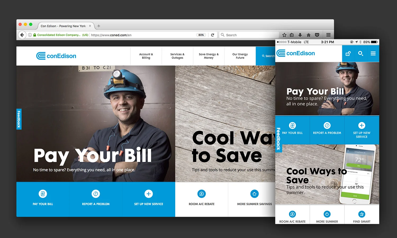
Con Edison Digital Transformation

Project Digital Transformation of ConEd.com
Role Lead User Experience Designer with POSSIBLE
Con Edison, one of the largest energy providers in the United States, provides a wide range of energy-related products and services for over 3.4 million customers in the New York metropolitan area. While their service is a lifeline for many New Yorkers, their decade old website proved to be hurting the customer experience by making it difficult for users to complete key tasks. Our agency, POSSIBLE, partnered with the digital customer experience team at Con Edison to define the path towards a simpler, smarter, and stylish new digital experience.
Discovery & Research
Customer Research
Everything starts with the user, so we started by conducting interviews with Con Edison customers to understand their pain points and what they wanted the next generation Con Edison website to do for them.

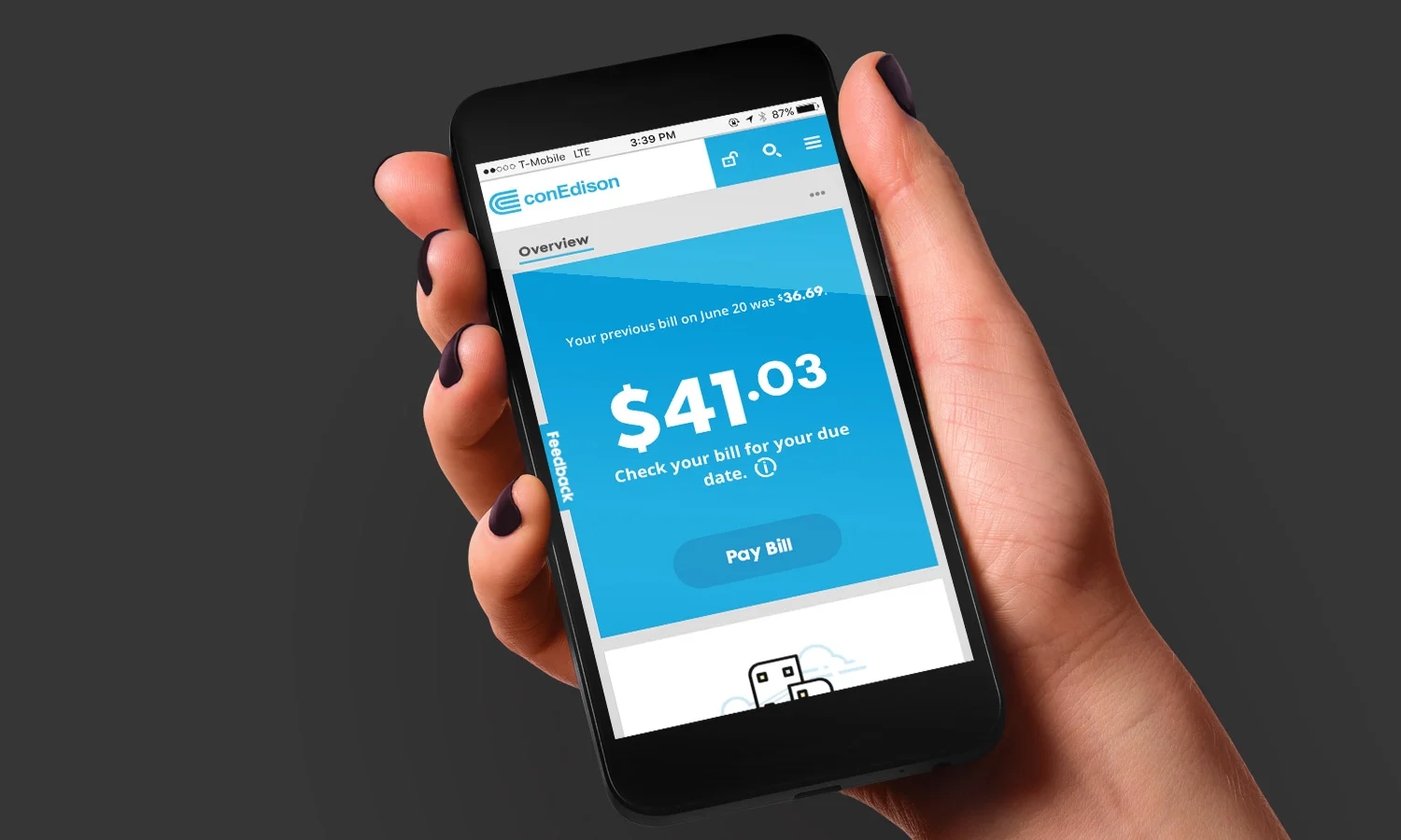
“I just want to pay my bill. All the rest of this information on the page is just noise.” – Customer
Customers avoided the public website at all costs. They found little value in a cluttered site that wasn't tailored to their personal needs–whether they rented, owned, or ran a business. They wanted easy access to key tasks they had to complete on a regular basis.
“If there is an outage, I don’t care about the website because I can’t access it.” – Customer
Research found customers were going other places during electric and gas outages. Many didn't know Con Edison offered a way to look up reported outages in their area.
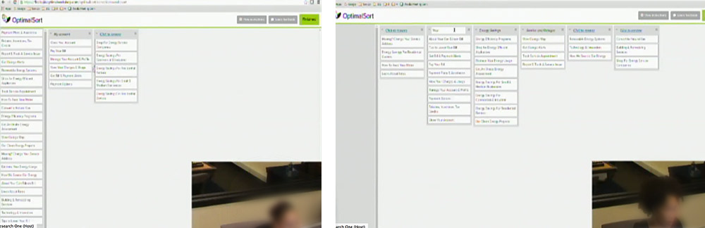
A new customer-centric experience needed to not only strengthen the brand by focusing on customer needs, but it also needed to provide features and content that anticipated the evolving customer needs. To understand how customers thought about content, I worked with our strategy team to implement user testing. Using content from the legacy website, we asked customers to do a card sorting activity–group pieces of content and label categories as if it were a navigational drop down menu. Results of the open card sort were analyzed, highlighting areas of agreement, weakness, and overlap in both categories and labels. These results helped us make informed decisions on how we structured primary navigation, categorized content, and chunked similar information.
Stakeholder Research

Our interviews with stakeholders exposed the need for content to be easily findable, regardless of what type of customer you are. Customers shouldn't need to dig to locate a key business form or revert to searching Google for a particular page on ConEd.com. Stakeholders wanted the digital experience to be self-service. Customer service representatives are overwhelmed with many of the same questions and to cut down on the number of calls to the call center would be a huge win for Con Edison and customers. Con Edison also wanted to become known as the energy advisor of the future–helping customers save energy and money.
In short, we needed to anticipate customer needs, intercepting with valuable information and surprising with innovation. Simply.
Decision Drivers for Site Architecture
From customer research
Half of the users separated savings by type (business vs. residential). We translated that to content across the site by segmenting based on user type.
With some variance with customers’ views of account and billing items, we narrowed the number of items by combining similar content and tightening the language.
Service was commonly correlated with with outages. Start, Stop, and Transfer Service was combined with Outage links.
Language was revised when sorting showed overlap around energy savings & energy efficiency–thought to be due to ambiguity around the terminology.
From Stakeholder Research
With the primary audience defined as customers, the main-level navigation was structured and built around the customer wants/needs and offered key pathways to transactional needs.
The categories that stakeholders wanted to promote most, were prioritized and surfaced.
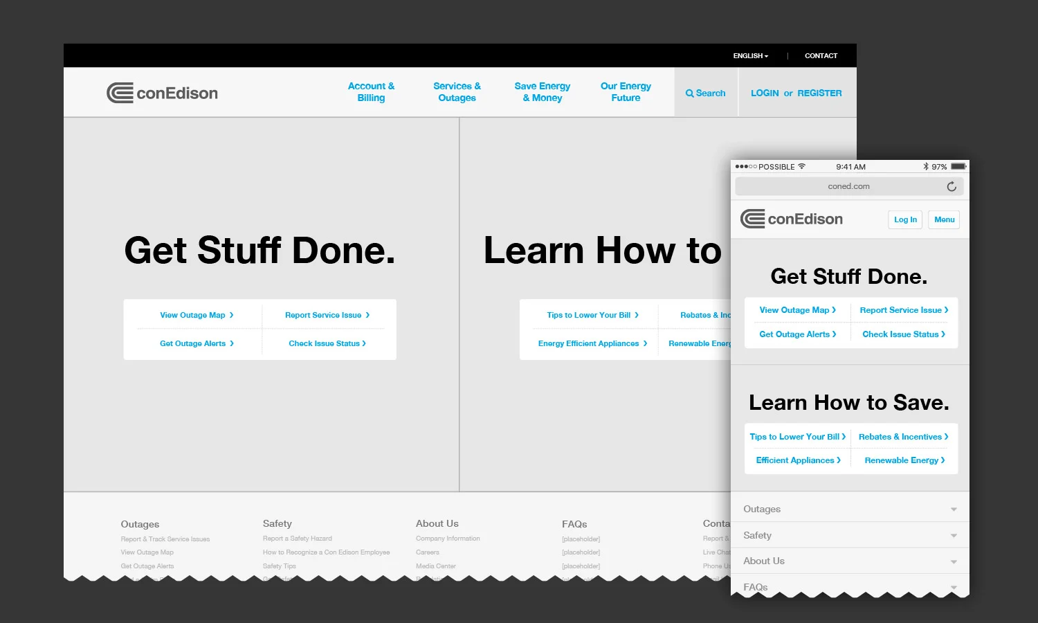
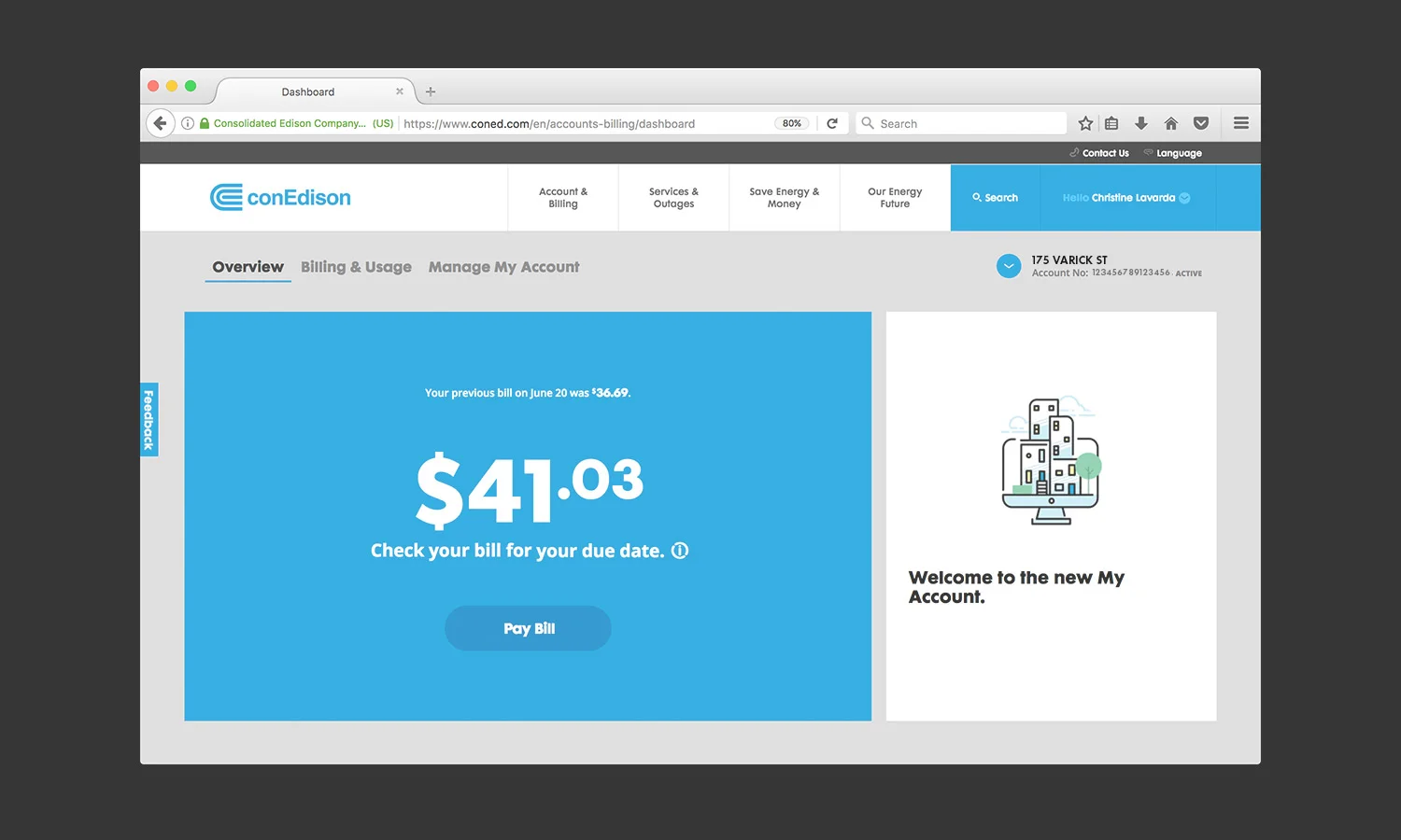
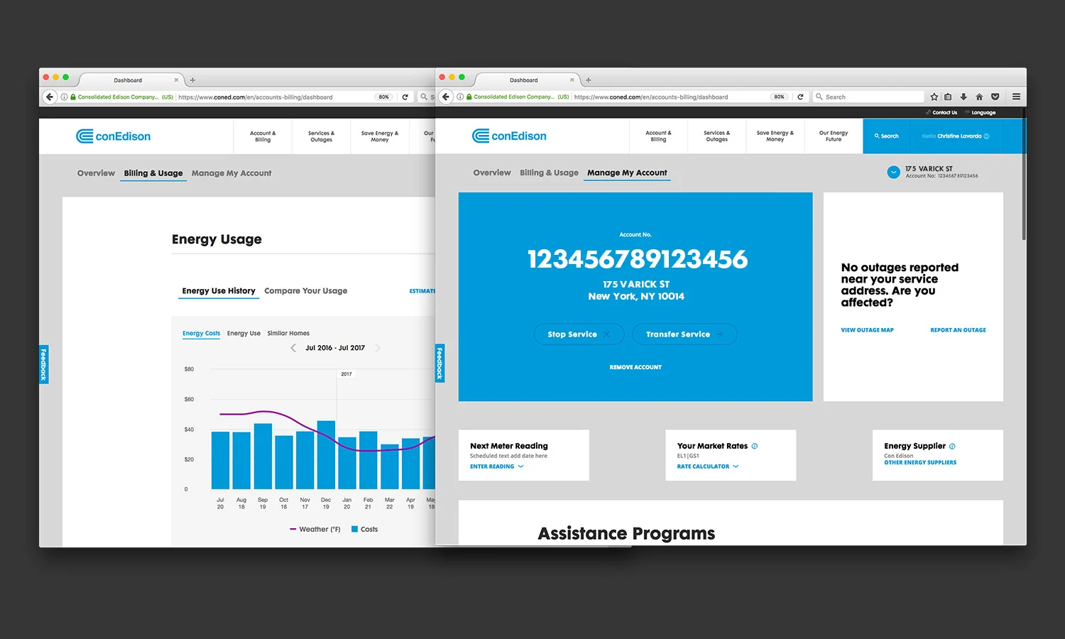
The 2 highest visited sections on the site are Pay Bill and Account. We surfaced access to this in primary navigation, under a category with a clear descriptive name, Account & Billing.
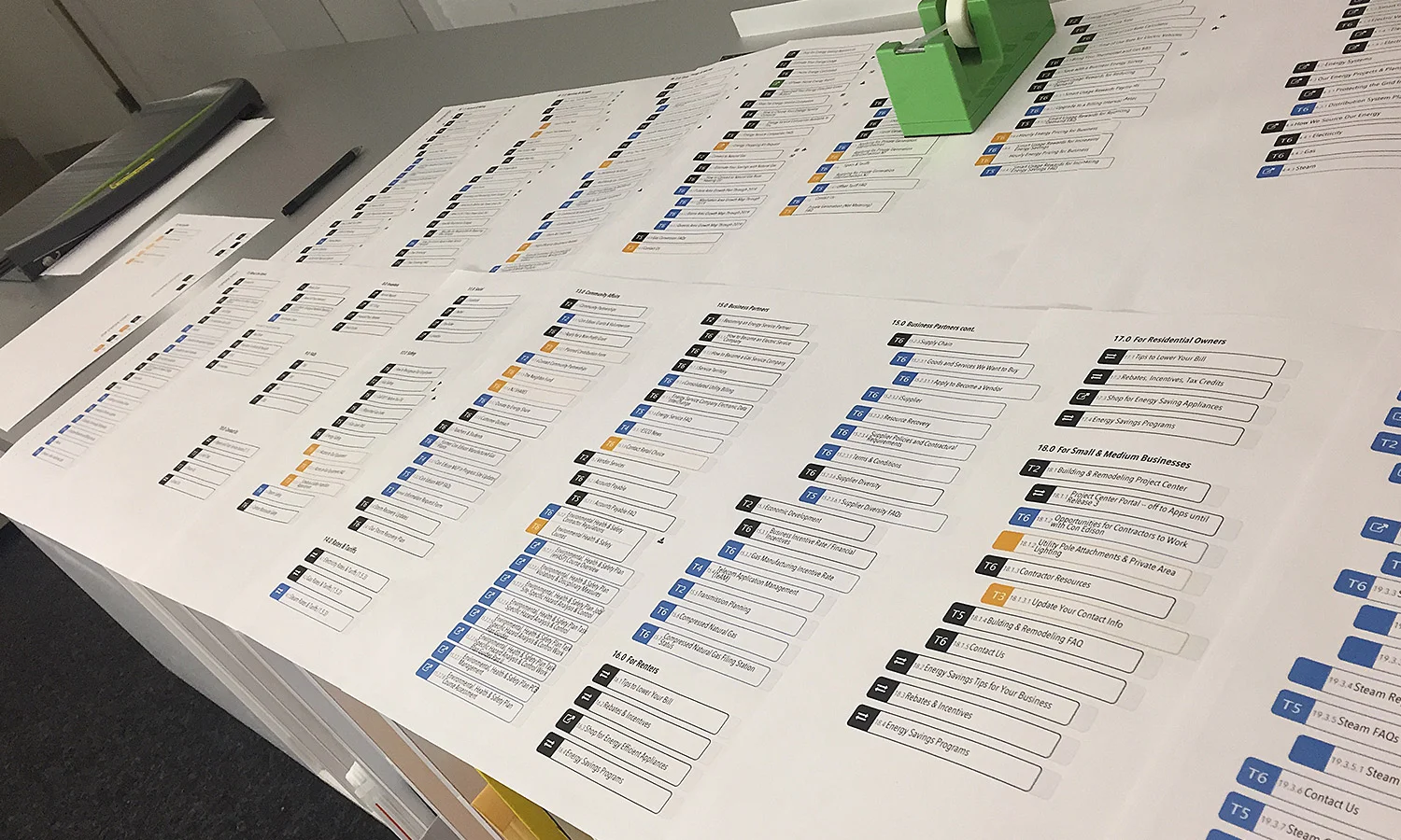

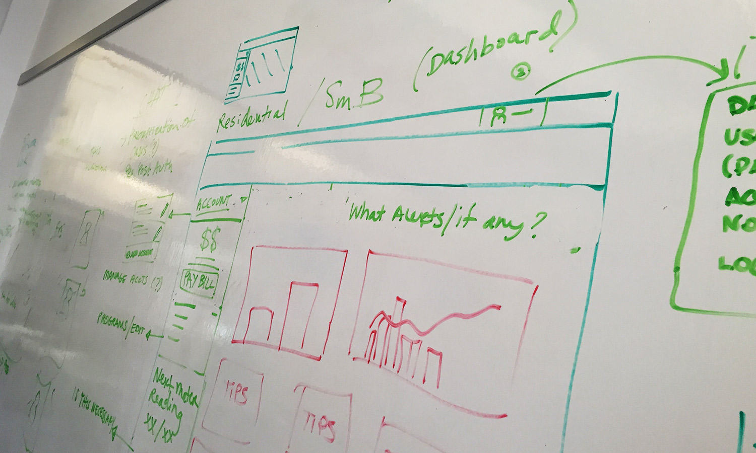
Using insights gained from user and stakeholder interviews, content research, and user testing, I lead my UX team in the creation of a unique sitemap, navigational structure, and a set of modules and templates that were used as a planning tools for the web architecture and design. But we didn't just think about current state, the sitemap, navigation, and wireframes we built took into consideration future state content and user experience, providing a scalable architecture and strategy to accommodate new programs & initiatives.
Design & Test
Modules & Templates
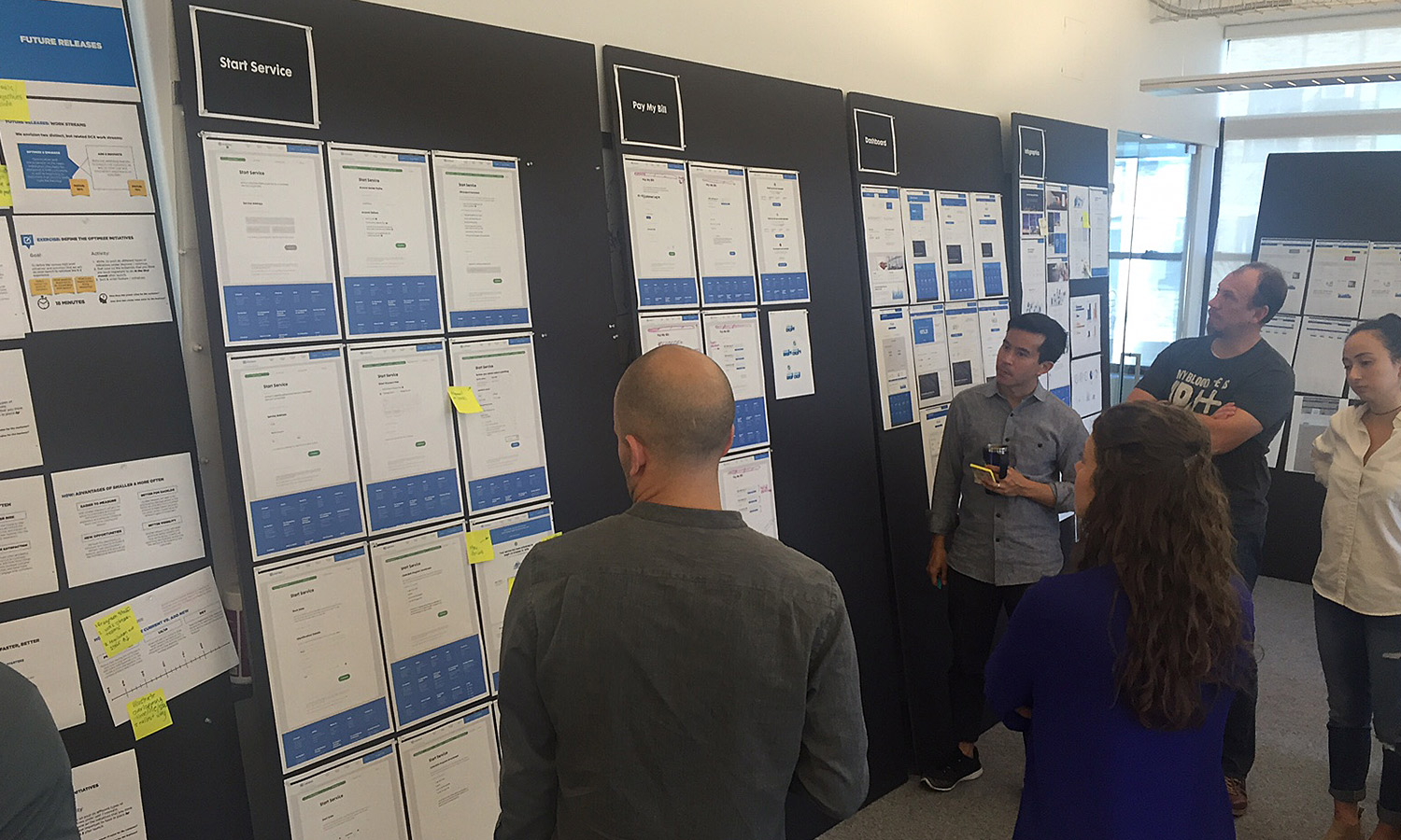
Based on the legacy content that needed to be ported over, new content that needed to be created to support new initiatives, and some additional value add ideas, our team built out 60 unique modules and 8 page templates.
The new template and module-based system created a standard structure and consistent design vocabulary that provides the flexibility to easily evolve as content changes over time. Each independent modular component–much like a building block–can easily be reused, combined, or customized to support changes in content and services–saving valuable time and effort.

4 of 60 Modules Created for ConEd.com (Image Module, Related Resources Module, "Was This Helpful" Module, Social Media Module)
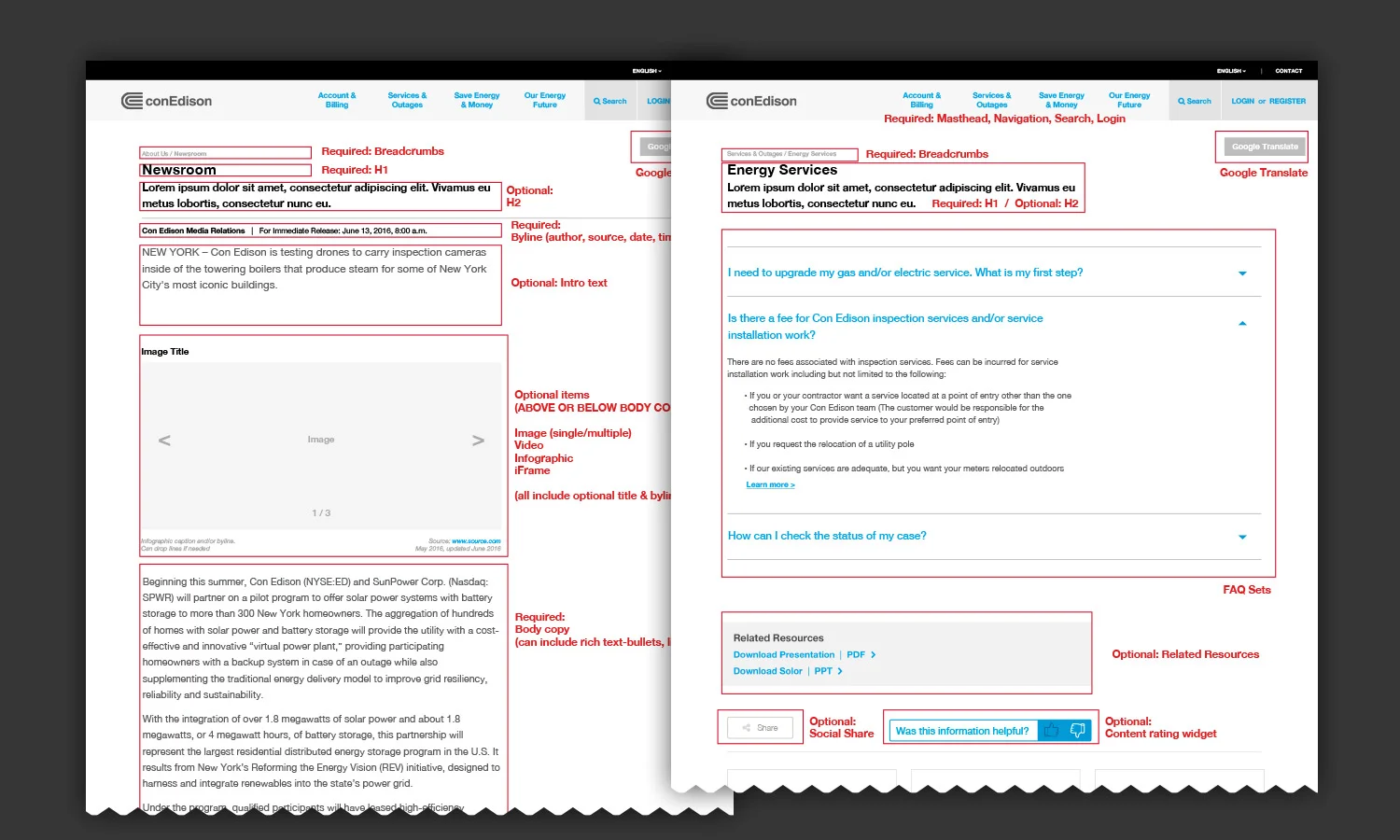
2 of 8 Templates Created for ConEd.com (Press Release Template and FAQ Template)
ConEd.com Wireframe Homepage Template
Iterate & Test
As the lead UX, I worked closely with the subject matter experts inside Con Edison to fully understand the business rules we would need to accommodate in the new account and transactional forms on ConEd.com. Through weekly review sessions, my team helped bring these key areas to life.
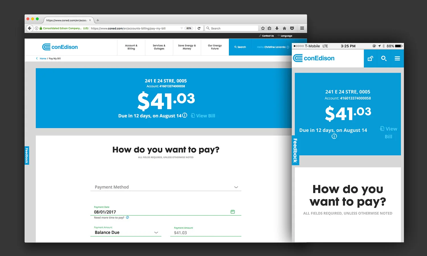
After creating some initial wireframe prototypes, we implemented one-on-one testing with 19 customers to evaluate find-ability of key content, understand how customers would use desktop and mobile websites differently, and their hierarchy of needs as a Con Edison customer. To understand how customers segment content, we presented participants with cut outs of key features and asked them structure their own account dashboard based on their needs. In a follow up task, we presented the customer with a key task they needed to complete on a mobile website prototype.
Based on our testing with customers, some of our key learnings and changes included:
Customers ultimately wanted to understand the story behind their bill and energy consumption, linking how much they are being billed to how much they have used. Because our pages were built using individual modules, we easily moved a bill analysis module directly under the bill balance module–providing more context for customers.
Navigation of the prototype was a challenge due to conflicting navigation models and unclear hierarchies of information. We did more research on secondary mobile navigation patterns, best practices, and even gorilla tested a variety of navigations. Experimenting helped us land on a flexible overflow navigation model. If more pages need to be added in the future, our structure can support it.
Creating an online account is thought to be a part of starting service, and the design of the two separate flows causes confusion. We became very cognizant of the language we were utilizing. We worked with our content strategist to define clear and concise terminology. Login/Register were intentionally combined to a single link to negate the confusion between starting service and creating an online account and "set up new service" is used as an alternative to "start service."
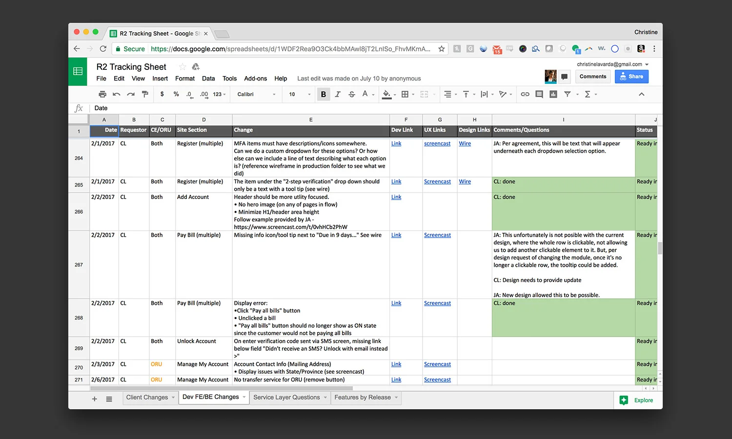
As I oversaw my team build out wireframes for the experience (in Sketch), I concurrently provided guidance for visual designers as they created all the front end page designs, worked with a business analyst to finalize the complex business rules, and held on-going meetings with the front end and back end engineers to make sure all the pieces were coming together as we defined. To manage various lines of feedback, I used a shared Google Excel document to track front end development issues, visual design needs, changes to business rules, and client feedback. This was a lifeline for our project as things move very quickly when working in agile!
Launch & Measure
Education & Governance
It doesn't stop after a new website launches. With a completely new architecture and re-defined content governance, we needed to provide the Con Edison team with the proper education and information on how to maintain what we created. You can read about my knowledge sharing session in my blog post "UX Knowledge Share."
1 Hotels
1 Hotels


Project 1Hotels (Starwood Capital) Digital Booking Experience
Role User Experience Designer with POSSIBLE
Ask
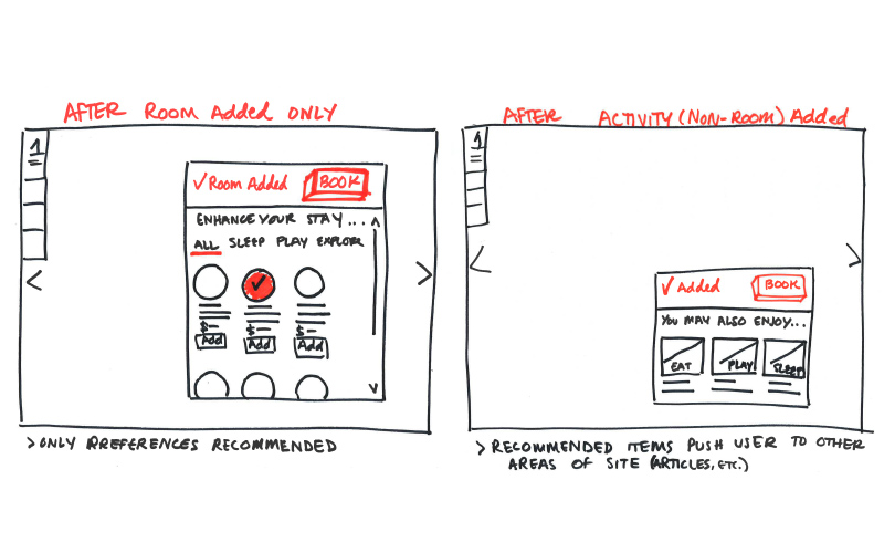
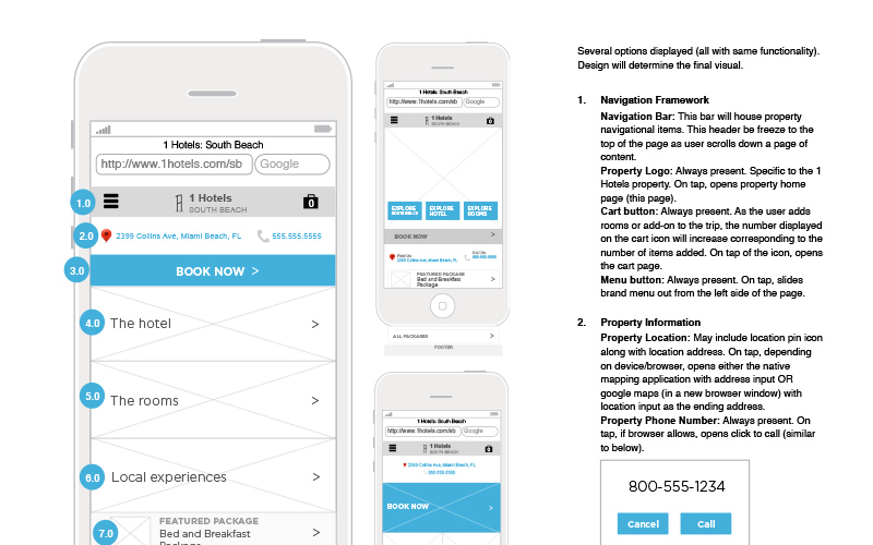
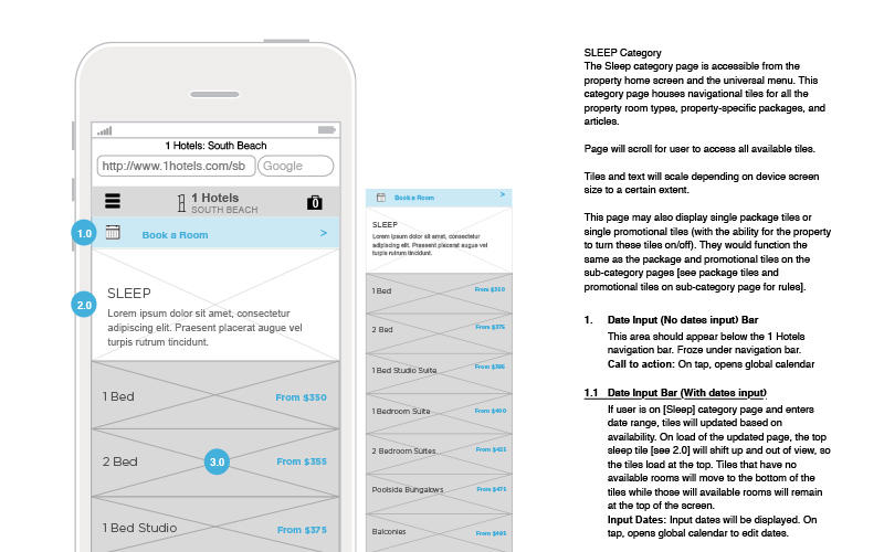
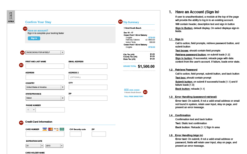
Create a world class hotel website that allows user to seamlessly research and book hotel rooms, cabanas, and activities before they reach the hotel, purchase items and find their way around with ease while they are present at the hotel, and are reminded of their unique experience and want to return after their stay.
About
Our internal UX team conducted several months of research on the hotel industry and target users to identify key pain points as well as opportunities in the industry. As a deliverable, we provided the client with a comparative/competitive report analyzing both current hotel and non-hotel websites, apps, and in-person experiences.
We worked closely with the client to host a variety of hands-on working sessions and individual interviews with key stakeholders to understand their business needs. The information we gained from our sessions guided us in building a feature list for a global brand site as well as individual properties for the hotel brand.
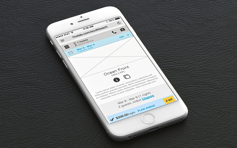
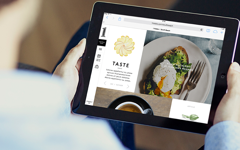
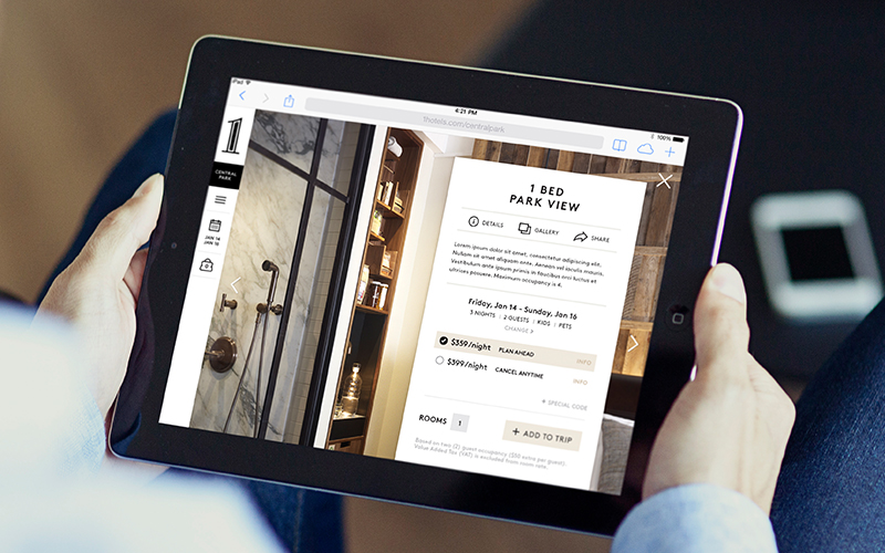
With a deep understanding of the key touch points in the user journey and our feature list, we used a mobile-first approach to created a full set of tech-focused annotated wireframes. Before development began, we did gorilla testing with users to validate usability on both paper and mobile prototypes. Our UX team worked with our technology partners to define all website functionalities and interactions. Visual designers and content strategists brought the vision to life and helped shape a site where customers can now book anything from hotel rooms, room service, cabanas, and on- and off-site activities and services.
WINNER: Gold - Communicator Award 2015 (Hotel & Lodging)
1hotels.com
Lead Dog
Lead Dog
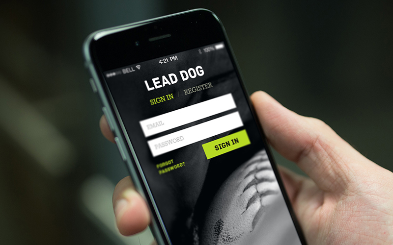
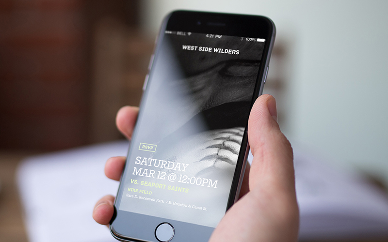
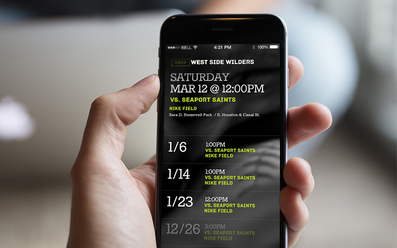
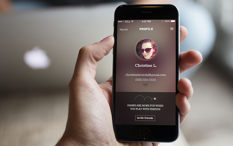
Project iPhone App Experience
Client Lead Dog
Role Senior User Experience & Visual Design Consultant
Ask
Define, create, and build a native iPhone application for people playing league sports in New York City.
About
There are thousands of intramural league sports teams across the country–from the common summer softball leagues to the more obscure (and quite entertaining) cornhole teams. The weekly games are meant to be a fun way to meet new people, play a competitive sport, and, of course, have a drink or two along the way.
Project
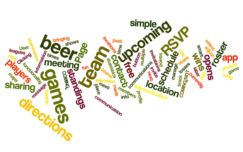
In the lean research we conducted, we identified several key participants pain points:
Communication between team members was fragmented.
Teams are commonly made up of a diverse group of work colleagues and friends. No one we interviewed had all of their team member's contact information. This made communicating game day changes/cancellations, attendance, and questions difficult to disperse and frequently led to members arriving late to games or missing games and in some cases causing the team to forfeit due to lack of the mandatory number of players.Schedules change as often as the weather.
All members mentioned 1 or more changes to their season schedule–cancelled game due to weather, change of a game location, change of game time, or rescheduled games. This made it difficult for players to know where or who to contact to access the most current game information.Nobody knows who's turn it is to buy the game day beer.
The majority of people we talked to were on teams that had a rotating list of who would be brining beer to the next game. However, in all cases these lists were all sent through email or texts, where the information was difficult to access and update, and was frequently forgotten about. No beer = Grumpy team
Our research also helped us identify 2 distinct user types who we would be targeting our product for.
Managing Player–This person is critical in setting up the team in a league, making sure all members pay their mandatory joining fee, receives all communications from the league (game schedules/changes/cancellations), and disperses important information to all team players. This person also participates in the playing of games, managing the game day rosters, and in brining beer.
Player–This is a person playing on the team.
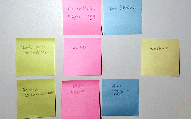
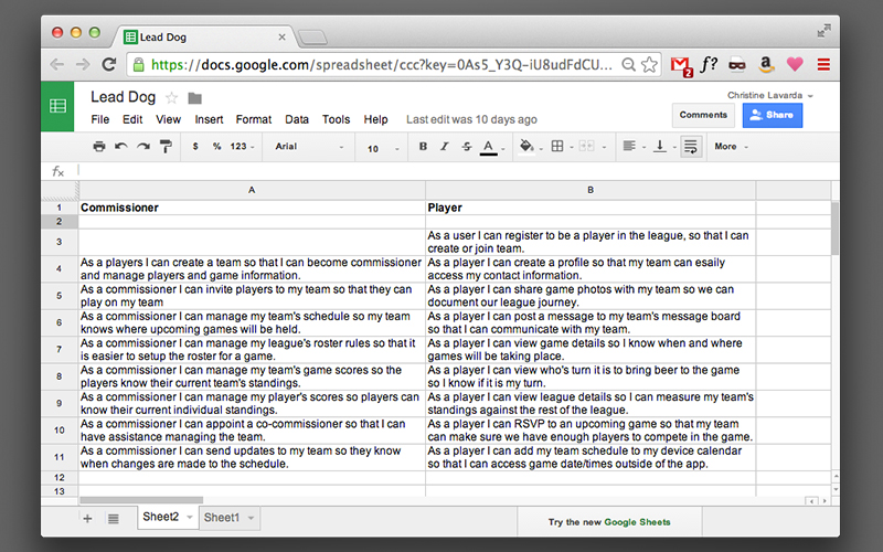
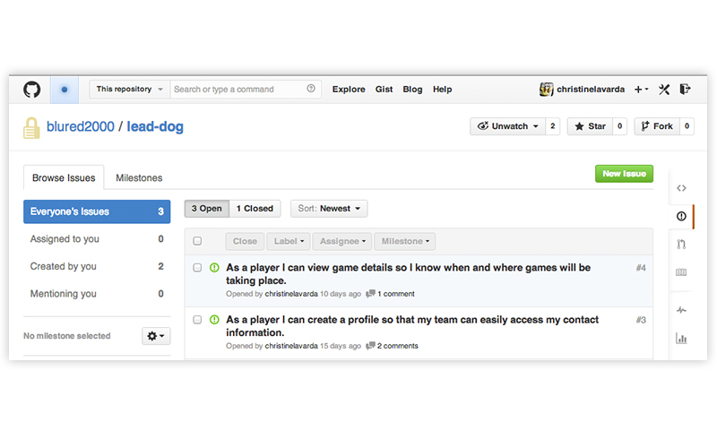
We used the identified users and the participant pain points to drive the ideation of our feature set list. To define exactly what we wanted the users to be able to do, we create two sets of user stories, one for the Managing Players and one for the Players.
Working in agile fashion, I worked one-on-one with an iOS engineer to iterate on key flows, screens, and detailed interactions.
Nook
Nook
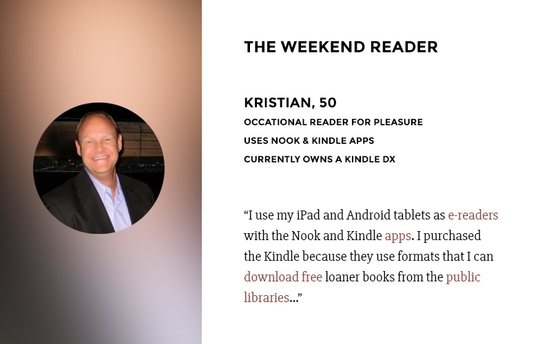

Project Nook (by Barnes & Noble) Product Re-imagining
Role User Experience Designer with POSSIBLE
Ask
Re-imagine the Nook experience.
About
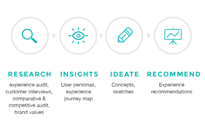
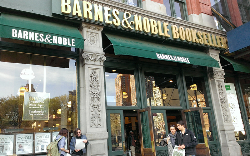
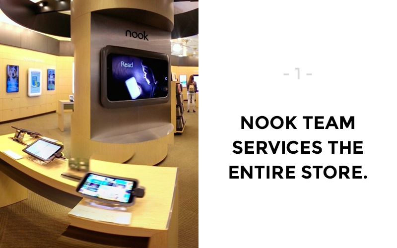
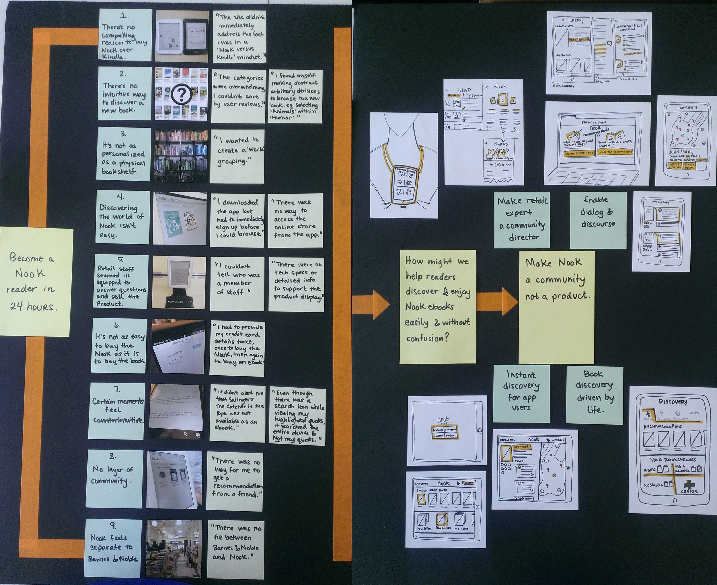
Working with a small internal team, we visited several Barnes and Noble stores throughout New York City to do lean research on:
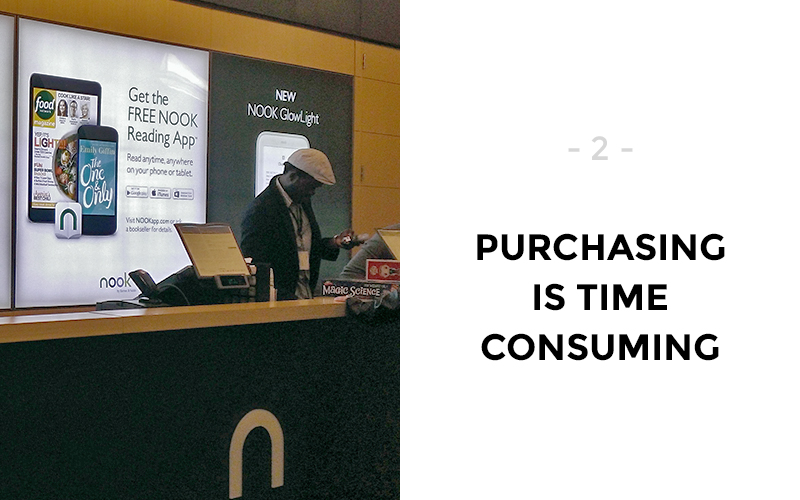
- The in-store purchase experience of a new Nook (store organization, employee assistance/knowledge, product research, product purchase, device set-up, content/e-book purchase)
- Customer sentiment, pain points towards the Nook
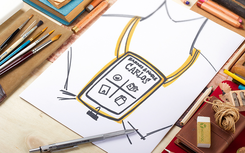
We identified a handful of key user types which we interviewed to understand:
- How/when they use Nook in their daily lives
- What they love about the current Nook experience
- Pain points they have had in relation to Nook
- Any technology-related experiences they have enjoyed
- Blue sky ideas for the future of Nook
Using the user research we conducted, we analyzed the findings across user types and discovered some key ares of opportunity:
- There's no compelling reason to buy Nook over Kindle.
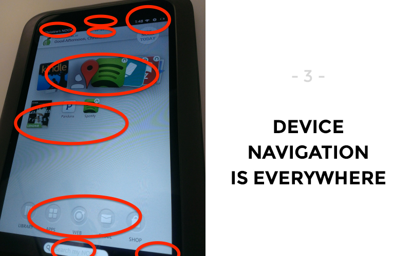
- There's no intuitive way to discover a new book.
- The digital shelf not a personalized as a physical bookshelf.
- Discovering the world of Nook isn't easy.
- Retail staff seemed ill equipped to answer questions and sell the product.
- Certain moments feel counterintuitive.
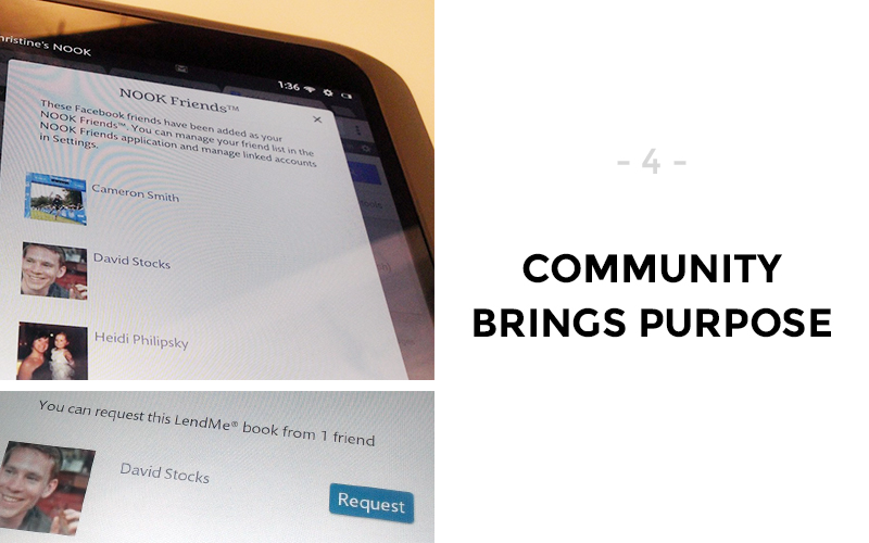
- No layer of community.
- Nook feels separate to the Barnes & Noble.
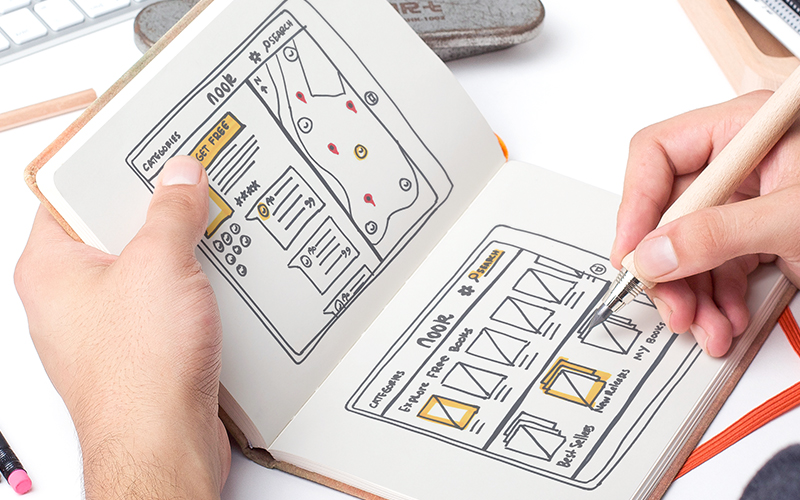
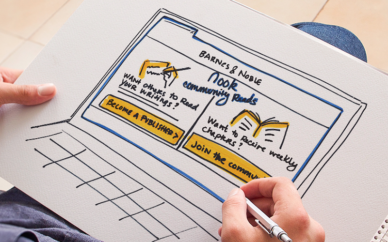
So, how might we help readers discover and enjoy Nook ebooks easily and without confusion? Our proposal to Nook focused on making Nook a community rather than strictly a product.
- Make retail experts community directors.
- Enable dialog & discourse.
- Instant discovery for app users.
- Book discovery driven by life.
Campus Job
Campus Job
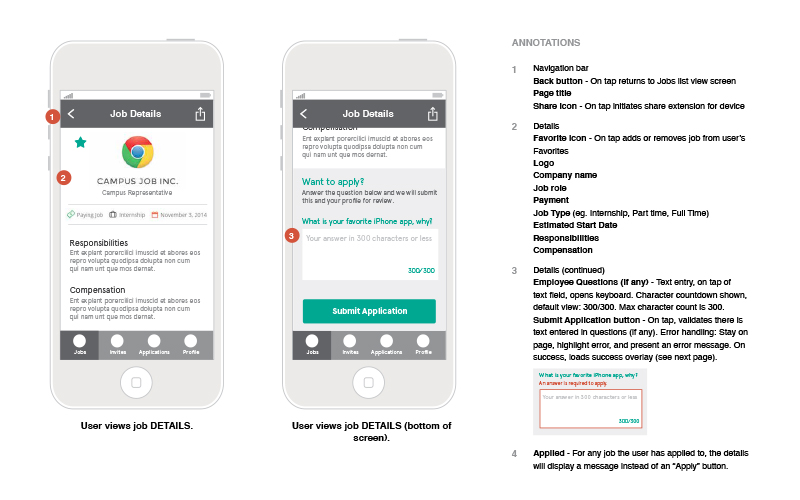
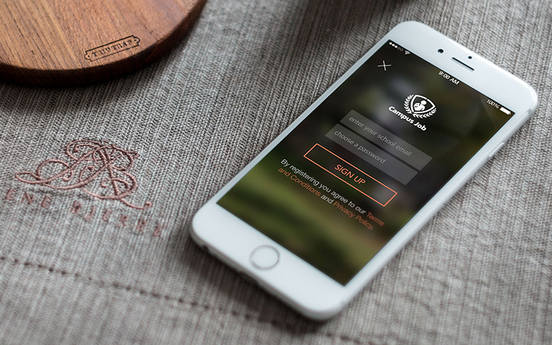
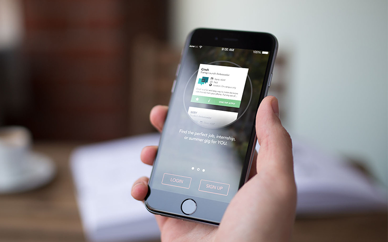
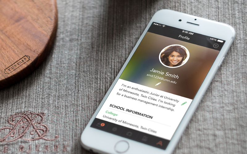
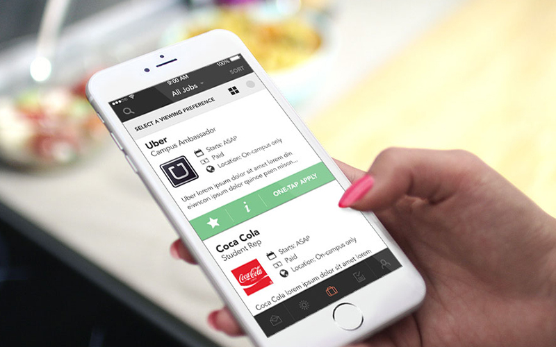
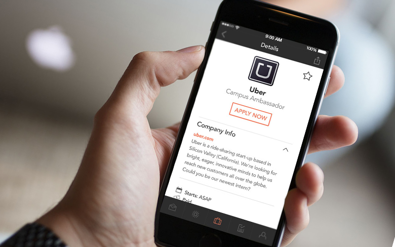
Project iPhone App Experience
Client Campus Job
Role Senior User Experience Consultant
Ask
Conceptualize and design a Campus Job application for iPhone.
About
Campus Job is a growing startup that connects college students with part-time, entry-level, or internship job opportunities. With a website up and running, they company looked to expand to a mobile app to target their college user base.
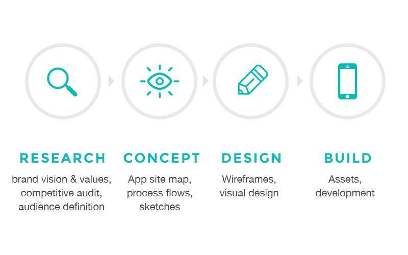
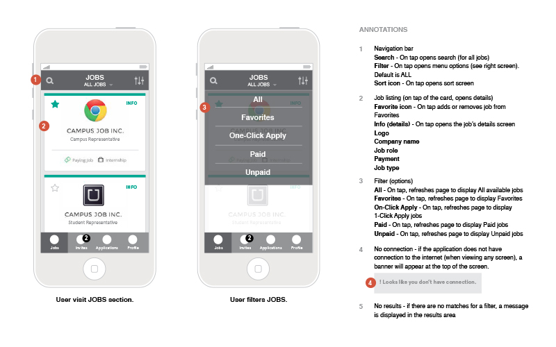
Over the course of 2 months I worked closely with Campus Job to define an MVP iPhone application. Together we defined a key feature set based on their user needs. Working through several rounds of feedback with key stakeholders, I built and delivered a full set of annotated wireframes for the engineering team, visual designs for app screens, an app style guide, and all app assets for development.
The app is currently in development and testing.
Art140
Art140
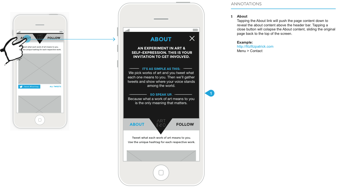

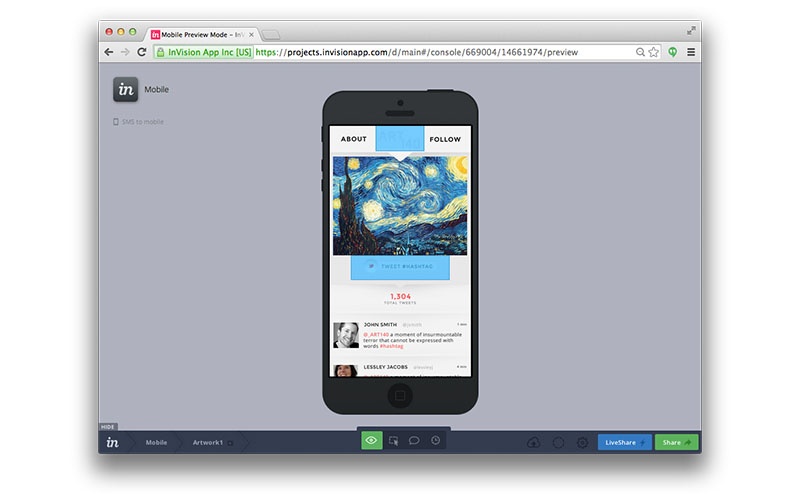
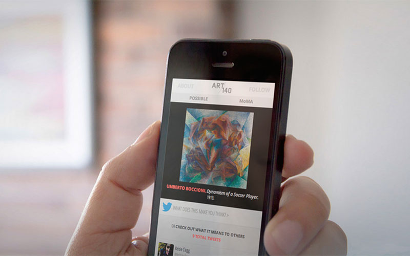
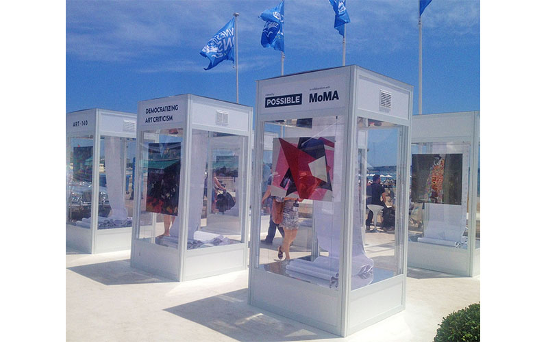
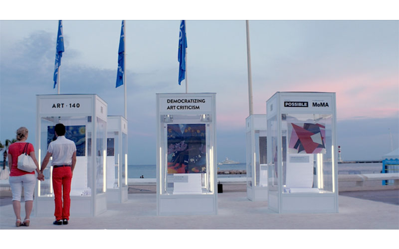
Project Art140 Art Experiment
Role User Experience Designer with POSSIBLE (in collaboration with MoMA)
Ask
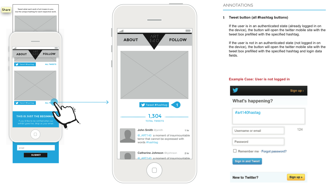
To learn what art means to different people in 140 characters.
About
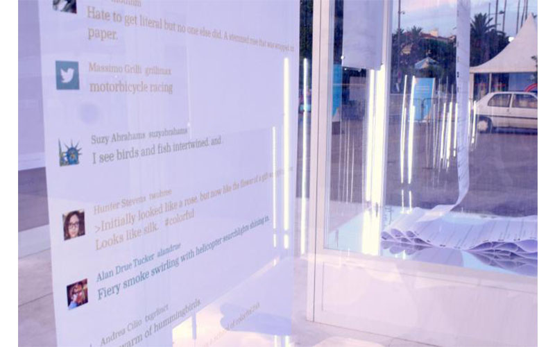
Art means something unique to each of us, but the invitation to participate in art has never been extended. In fact, the art world can feel like an elitist club—exclusionary and intimidating. Meanwhile, social media is transforming every pillar of culture, from shared encyclopedias to citizen journalism. ART140 extended this trend to revolutionize the experience of art. By harnessing the power of Twitter, we invited people from all walks of life to express what specific works of art mean to them. We broke down the wall that separated the art world from the people who appreciate art but are too intimidated to express their own interpretation.
Insights from Experiment
- The Stream of Consciousness Index – Analysis determined which tweets reflected a “stream of consciousness” versus those that utilized more conventionally structured language. The familiarity with a specific artwork directly correlated with a higher ranking on the index. Tweets critiquing less familiar artworks resulted in a lower ranking.
- The Highbrow Index – Analysis determined which tweets were the loftiest in tone as well as which artworks attracted the most of these tweets. When compared to tweets relating to entities such as celebrities and popular bloggers, ART140 tweets ranked at the index’s lower end, an indication of the decidedly human and straightforward way the art was referenced.
- The Positivity Index – The majority of tweets about ART140 were positive in nature. A work’s ranking on the index correlated with the artist’s composition and subject matter. Gauguin’s Seed of the Areoiranked highest, partially due to its Tahitian backdrop.
- Time of Day Matters – Different times of day evoked different emotions, with lunch time bringing the “happiest” of tweets. However, the greatest volume of tweets posted at night when the work day ends, especially for Van Gogh’s The Starry Night.