Viewing entries in
design

How to integrate UX research into a design schedule

Comment

How to integrate UX research into a design schedule

Building a digital product is a highly involved iterative process that can bring improved value or new functional features to users, but unfortunately I’ve often been a part of teams that either don’t have time to conduct user testing or lack the budget to do so. Working under these common constraints, I’ve developed a testing model that can be adjusted to fit tight timelines and can be run relatively cost-free, because even the smallest amount of testing can help UXers preemptively identify usability issues and evaluate everything from low-fidelity concepts to fully fleshed out design prototype.


Planning for UX research

Whether working with design agencies or consulting with brands, I’ve commonly worked in 2-week design sprints. These sprints follow a predetermined set of activities and exercises, including activities related to validation and usability testing. Below is an example of how I structure my UX testing schedule. The diagram maps the key testing tasks across a 2-week design sprint. (Keep in mind, this design sprint would also include other tasks and meetings outside of this testing plan.) Based on how much time you have to work with, the research tasks can be adjusted and moved around to fit your team’s schedule and timelines.

A simple testing schedule integrated into a 2 week design sprint. These key tasks can easily be adjusted to fit any form of design timeline.

A simple testing schedule integrated into a 2 week design sprint. These key tasks can easily be adjusted to fit any form of design timeline.


Week 1 | Source & invite participants

At the beginning of the sprint, I take a look at our user base that we’re designing for (as this changes regularly based on the project). If possible, it’s beneficial to source real users of the product that you’ll be testing. Participants can often be sourced through client relationships or other company lists. It’s good practice to collaborate with the extended to understand how to best source these participants. Many times if sessions are 30 minutes or less, participants will offer their time for free, but offering a small gift card can also increase user participation. If you’re unable to use active product users, you can use 3rd party services to source participants (for a cost).

I typically source 8-9 participants, with the knowledge that there will usually always be 1-2 individuals that are unable to attend last minute. While this may seem like a relatively small sample size, it’s generally a good indicator of problems or gaps. 0 testers means 0 insights, so if truly limited by time or budget, push for testing on the most crucial areas.

For each testing session I assign a single facilitator and 1 silent notetaker. Having a few extra listeners present can also promote design transparency among business, engineering, and product constituents, but be mindful of including too many additional ears as this can sometimes be intimidating to participants.

Below is an email template I’ve used to invite participants to testing studies. Using this as a base, the language can be adjusted to fit most validation scenarios. The invite is sent to the participant along with any the notetaker and listening-only attendee(s).

My invitation template sent to individual research participants.

My invitation template sent to individual research participants.

The first week of the design sprint is then used primarily for design iterations–working with the cross-functional team on business requirements, engineering constraints, UX flows, prototypes, and mid-fidelity designs.


Week 2 (Monday) | Align on research objectives & build test stimuli

During the first week of the sprint I take notes during any design share outs to gather ideas for the testing sessions. These notes are my way of starting a conversation with the broader team.

As transparency is a strong value of mine, making sure that I’m able to share my testing ideas, as well as gather thoughts from the rest of the team, is crucial to not only building trust amongst the product team, but important in building a well-rounded end product.

During an alignment meeting with the product manager, we discuss key themes we’re curious about or questions we want to answer with the research. For example “expectation versus reality” is a common theme I often build tests around. Does the user expect something and is confused when it’s not what he expects? Other times we’ll have a more tactical usability test we want to run, such as “I want to understand if the user can make it from point A to point B without any missteps.” Research objectives are always project-specific and important to define and align on upfront.

With test objectives defined, the test stimuli can be built. Most recently I’ve been running remote user testing sessions by making pages in Figma specifically centered around the testing session. I place all the labeled design stimuli on that page (and later walk the testing participant through the stimuli while sharing my screen). Figma is also useful for sharing prototypes to validate usability or evaluate a more realistic interaction with screens and content.

While you will sometimes know the exact visuals, content, or flows you want to test, the stimuli creation work may sometimes overlap with the writing of the moderator guide, especially if this is a collaborative process with other team members.


Week 2 (Tuesday) | Build moderator guide & field learnings documents

The moderator guide and field learnings spreadsheet are two documents I use during the individual testing session–each with a specific purpose.


Moderator guide

A moderator guide is a document created to conduct a research session. The format and content of a moderator guide will vary depending on the type of test and how it’s being run. Because this guide may be shared across team members (and potentially outside the immediate team), this is the content I like to include in my moderator guide:

  • Test objectives & goals - It’s nice to re-surface these to keep them top of mind during the testing cycle. They’re the highest level themes that the qualitative (or quantitative) research data will help get answers to.

  • Facilitator/s - This is the individual or individuals that will be running the research session. This gives anyone viewing the document a point person to reach out to with questions about the study.

  • Audience - This is the specific user group that will be using the end product (and more specifically who will be the research participant).

  • Introduction - This is an overview that introduces the study and the format. I include project context, study timing, an introduction to other individuals who are listening in or taking notes, and a request to record the session. Before diving into the test session with the participant, I use this information to guide my introduction to the study participant.

  • Links to stimuli - These are any prototypes, designs/visuals, flows, etc. that will be used in the testing session. I link to my Figma design file for anyone who wants correlate the stimuli to the questions being asked.

  • Link to field learnings document - This is a spreadsheet built off of the moderator guide questions. Its primary use is to capture all the data during the research sessions for use during data analysis post testing. (More on this below)

  • Research questions - Grouping questions around a theme or stimuli can help structure a smooth session. I like to run semi-moderated sessions where I’m asking all the primary research questions. However, since this approach is a bit more loose, you’re not strictly tied to only asking the questions from the moderator guide. I often ask follow-up questions that go off script. This can allow you to get data that you may not have otherwise gotten if only sticking to the script.

My moderator guide template.

My moderator guide template.


Field learnings spreadsheet

The field learning spreadsheet is a spreadsheet built off of the moderator guide questions and used to capture research data.

My spreadsheet is set up with 3 primary tabs:

  • Raw data - I add all of the research questions in the left-most vertical column and a vertical column to the right for each participant testing sessions. During the testing sessions, the notetaker uses this spreadsheet to input the qualitative (or quantitative) data. Setting the document up in this way allows my team to easily view data across a specific topic area or question. It helps us get a quick view into any themes that are appearing without having to do too much digging. Also included to the far right is a column to track insights. Jotting short notes in an insight column during the study makes it easier to create a quick roll-up report later.

  • Participants - This is a list of all the participants taking part in the study. It can include data such as their job role, location, contact details, or any other recruitment-specific information.

  • Insights report - This is a tab I use post study to build a report based on insights from the research. (More on this later)

My field learnings spreadsheet template.

My field learnings spreadsheet template.


Week 2 (Thursday) | Run the research study

After finalizing the tools used to run the research session, it’s time to jump into testing. I typically run all in-person (or remote) testing sessions on Thursday. Because this is near the end of the sprint, the team should feel confident in the designs being tested as they’ve gone through several internal product, engineering, and design team reviews before being shared with users.

Study Structure
I like to run shorter research sessions since we’re conducting them bi-weekly in our schedule. If you’re scheduling meetings back-to-back, it’s good to consider keeping the sessions to 25 minutes (or 55 minutes depending on how long you need with participants) as you’ll quickly learn that having those 5 extra minutes for a bio break (or to sneak in a snack) between sessions becomes necessary for session setup and remaining fully present during the testing sessions.

Pre-Testing

  • Do a dry run through of the test prior to the real sessions. This can help you catch last minute errors and make switching between stimuli and questions go much smoother. Iron out those kinks ahead of time!

  • Consider whether you will record the sessions. If you’re not transcribing word-for-word during the session, having a recording to reference later is beneficial to pull quotes from or to use as a visual/audio source to highlight during a share out presentation.

During Testing

  • Establish a positive rapport with participants. Instead of jumping right in to the study, consider asking participants how their day is going or if they’re planning anything fun for the weekend. It not only helps them open up, it also begins to build a foundation of trust. The ultimate goal is to make them feel comfortable enough to be open and honest with their responses during the study.

  • It’s OK to go off-script. The research questions are there as a guide and are beneficial to get answers to the same questions across users, but outside of that I always ask follow-up questions if the participant says something that brings up a new question that’s not in my guide. Sometimes these spur-of-the-moment detours can lead to unexpected “ah-ha!” insights.

  • Do quick check-ins with the notetakers and silent listeners to get a gauge on participants, themes that are arising, or interesting insights that are showing up. I like to do these after each session for a minute or two, if possible. It helps find areas that may be interesting to dig in to with the next participant.

Post Testing

  • It’s time for data analysis! With good notetakers, the spreadsheet will be full of juicy data points. Analysis can be done individually, but is best when there is some collaboration between all those who sat in on the sessions.

User testing sessions sharing a prototype with users over a Zoom video call.

User testing sessions sharing a prototype with users over a Zoom video call.


Week 2 (Thursday) | Analyze the data

So there’s a spreadsheet of data. Now what? Time to go digging for gems! In my spreadsheet with the raw research data, I add 2 new columns: Highlights and Insights.

  • Highlights - Looking individually at questions posed, across all participants, I use this column to highlight interesting participant-specific comments. Sometimes there will be other questions that help add support these highlights, which I also call out. If there are any powerful quotes, I’ll include them here for reference later.

  • Insights - Based on all of the qualitative (and/or quantitate) data from the research, I develop insights, or new understandings of what was tested that guide actionable recommendations. (It’s important to also note that recommendations aren’t only limited to the UX as they may extend to content, engineering, or business rules.)

Field learnings spreadsheet including research highlights and insights, across a specific topic/question.

Field learnings spreadsheet including research highlights and insights, across a specific topic/question.

Another tool I’ve used to analyze data is a product call Mural, a digital workspace for visual collaboration. Similar to my spreadsheet setup, data can be collected on digital sticky-notes and moved around and grouped to identify themes. In my experience, I’ve found taking notes in a spreadsheet during a testing session is more efficient than creating individual post-it notes in Mural. But, as Mural is visually flexible and easy to collaborate in, it’s preferred by some designers.

Mural document visualizing research data.

Mural document visualizing research data.

In my field learnings spreadsheet, I use my Insights Report tab to build a “down and dirty” findings report to share with my cross-functional team. Since I run testing sessions bi-weekly, I tend to spend less time on creating a fancy presentation when the key stakeholders are primarily concerned with our next steps based on the data. I use this report to guide a collaborative conversation about the product and how to proceed forward.

While this spreadsheet is often times my final report deliverable, it’s important to build a report based on your audience and their needs. Sometimes a bit more design love is needed. I often find this is the case when I’m presenting to higher level business partners. But even with limited effort and time, pulling together some key insights to share in a 30 minute presentation can be extremely powerful.

Insight report tab in field learnings spreadsheet.

Insight report tab in field learnings spreadsheet.

Because my report is built for a broad range of product partners (engineering, product, business, and design) my format includes both contextual testing information as well as the key findings and next steps. These are the primary sections I include in my research reports:

  • Testing overview & goals - Because this report is shared with a broad audience (and potentially outside of my in-person presentation), it’s beneficial to include the primary testing objectives and goals that the team aligned on at the beginning of the sprint.

  • Methodology - This is the framework used to setup the research study. I include the type of study and session length, the number of participants we scheduled and how many actually showed up, the research facilitators and notetakers, how the research was conducted (via Zoom, in person, etc.), and the type of tests that were done (prototype testing, card sorting, design analysis, etc.). This information, along with the testing objectives and goals, provides valuable background context to ground the reader or listener.

  • Insights & themes (typically 5-7) - This is the meat and potatoes of the report. Based on the insights identified in the raw data, I pull out primary themes. Depending on the project and research, this may be a very broad theme or a rather narrow one. Each theme is expanded upon through the identification of our hypothesis and assumptions followed by the research insights. Including supporting quotes, video clips, and/or quantitative numbers from the research will make the story of the data much more compelling.

  • Next steps - Based on the insights, next steps contextualize where the the team can make actionable improvements to the product or design. While I contribute a starting point for next steps, and knowing some next step may fall outside of UX, this initial list helps open up the conversation for the extended team to play an active role in collaborating on next step-specifics.


Week 2 (Friday) | Share Findings & update designs

After the output report is finalized, it gets shared on the last day of the design sprint. As part of a design sprint, I have a reoccurring meeting on the calendar for business partners, products managers, engineers, designers, and anyone who’s interested in listening in on what was tested and the outcomes.

Over a Zoom call, I walk through the detailed report, using the overview to set the stage for the key insights content. Pulling in supporting content such as design visuals tested or screen recordings from the research sessions provides color to a simple spreadsheet presentation. A pause after each theme presented allows for a brief discussion around the topic and the opportunity to align on next steps, collaboratively. These next steps guide changes that need to be executed on the UX and visual design as well as other areas outside of design.

Depending on the complexity of the updates, follow-up meetings may need to be scheduled and/or the work may require an extra day to be delivered, but in most cases, if testing is a part of the regular sprint routine, updates can usually be quick turn-arounds and delivered the same day or the following Monday.


Week 2 (Friday) | Testing retrospective

To close the testing loop, the team regroups on the last Friday of the sprint for a retrospective (specifically focused on testing). A retro meeting is a discussion with the extended product team, with the primary goal of improving future sprints. I use the meeting to explore what went well during the current sprint, areas that can be improved upon (opportunities), and any individual actions we want to take during the next sprint.

A UX retrospective board the team collaborated on in Mural.

A UX retrospective board the team collaborated on in Mural.

Because this is a collaborative meeting where all individuals who participated in the sprint should be participating (business, product, engineering, design, etc.), we use Mural, a low-cost online tool that is easily accessible by all members. Mural allows us to create a simple 3 column layout with our categories: What Went Well, Opportunities, and Actions.

Over a Zoom meeting, everyone is given 5 minutes to write digital post-its with their thoughts on the first category, What Went Well. Topics considered should span the entire testing process–participant sourcing and scheduling, resource allocation, communication, documentation, user testing or reporting. At the 5 minute mark, a member of the team reads aloud all the post-its. The same process is continued for the Opportunities category. It’s a healthy practice to allow time for discussion on topics, specifically around areas that can use improvement. If a discussion is going too deep, it’s an indicator that there may be a need for a separate discussion. These topics can be parking lotted and addressed as a next step (meeting) in order to continue with the retro.

UX research retrospective held over Zoom ever design sprint.

UX research retrospective held over Zoom ever design sprint.

If retros are a new concept to your team, it may take a bit to get into a well-oiled groove. Having a routine retro cadence can provide the time and space for participants to grow into being more open and transparent with their feedback. With the support of organizers and managers making meetings a “safe space” to share, retros can become one of the most beneficial meetings of the sprint. These collaborative meetings and discussions are crucial in surfacing the root causes of issues so they can be mitigated in future sprints. And, not only does this practice improve team dynamics, processes, productivity, and outputs, it helps reinforce things that are already working for the team.


Week 2 (Friday) | Design handoff

I’ve made it through testing. 💪

If I was running validation testing with the ultimate goal of handing over design work to the engineering team, this is the last task of the week. After making final design adjustments coming out of the research share out, I package my designs in Figma. A “Handoff” page is created in the file and light annotations are included to call out key UI or interactions (that have also been discussed in weekly meetings). In some cases if I was working with a prototype, I’d have a final page for the Prototype and include a title page that would include direct links to key parts of the user flow(s). This gives the engineers the option to view the flat screens (like below) or to navigate the lightweight prototype.

A page is created in the Figma file for the final design handoff screens (and light annotations).

A page is created in the Figma file for the final design handoff screens (and light annotations).

And to tie the sprint up with a pretty little red bow, I craft a Slack message detailing the finished design work and share this with the extended team (product, engineering, and design).

How I share design files via Slack with the product and engineering team.

How I share design files via Slack with the product and engineering team.

While there is some amount of effort and time needed to incorporate UX research into a design process, you can always find ways to make it work within your constraints, whether that be time, resourcing, or budget. Even the smallest amount of validation in a project can bring value to the greater team and product. Happy researching!


I’d love to hear from you!

I hope the overview of my UX research process can provide you some insight into one way of incorporating UX into a product team. I know my way certainly isn’t the only way, so I’d love to hear from you!

  • How does your team integrate UX research?

  • Do you have a set process or tools that work for you and your team?

  • What are your biggest challenges in integrating UX research?

Comment

The most common questions I get asked by junior UXers

1 Comment

The most common questions I get asked by junior UXers

Forward

While it’s only October, 2018 has brought me some incredible career experiences; I finished off a large-scale (2 year) digital transformation of New York’s largest utility provider, did my first technical UX writing work for the most famous fitness brand, and got more than knee-deep learning about the crazy-complex insurance vertical. Whew. Let me catch my breath.

But, it also brought me an incredible array of cold-contact-emails from junior UX designers looking to have casual coffee-date conversations about their UX career. (I applaud all of you. This is NOT an easy thing to do.) The first email made me think about how much I needed this chat 10 years ago, so I made it my goal to say yes to every single email. And, I have.

I know I won’t always have time to schedule these in-person meetings or vid-chats (time = money, yes), so I created a list of the top questions that I’ve been asked this year. Based on my past 11 years in the creative/UX industry, I hope this can act as a starting point for anyone new to UX or anyone curious about where to take their UX career.

May my experience help you navigate your careers,
Christine


1. If I’m a junior UXer, should I work at an agency or a start-up?

My short answer…

Both. Both offer extremely different, but inherently valuable, environments and experiences to help you decide where to take your future career. 

My long answer…

Start-up Life
Early in my career I spent several years at a 5 person creative shop in midtown where I worked side-by-side two developers who helped me understand the complexities of the engineering world and how it could affect the decisions that I made on the creative end of the spectrum. I learned how to work fast and learn faster, balance the trade-offs between technology and UI, and Google-search the hell out of things that I didn’t know. And, the freedom to explore and integrate the use of new tools and practices made my sweet little soul explode with joy.

Adversely, in start-up environments you’re dealing with a more restricted team. You may have less senior leadership who carry past experience to lean on, and with less experience, you’ll have less knowledge to determine the ideal process for a project execution. This can create areas of risk which may fall back on you if things don’t work out. And, done forget, there will be late nights. Yes, inevitably, many of them. But, hey, the snacks and alcohol are great perks. 

Agency Life
Post start-up life, I got a job at a global digital agency. An agency that had won some of the most prized global awards, executed large-scale projects with the world’s biggest brands, and boasted a strong company vision for the future of the local office. If you’re not glossy-eyed by that already, one of the best part of working here was the opportunity to work under some of the most talented individuals in the UX industry. I beefed up my UX best practices (and how to articulate why/when to break them), learned when and how to properly execute a wide-array of ux research methods, and found peace when I learned how to say “no.”

Yes, there will typically be more hands fulfilling more specialized roles. You’ll have lots of resources to answer whatever questions you run into (and yes, there will be lots). It’s the ideal place to meet insanely brilliant people–inspirational leaders that will get you to drink whatever kool aide they are selling, obscenely multi-talented creatives that will make you wonder if they have a life outside of the office, and the most assiduous user experience practitioners that will kill you with both their vast user data and lucid imagination.

Yes, it’s a great place to gain a whole different set of skills and knowledge, but with more people, and more processes, and more red tape, agency-life tends to run a bit slower than start-up world. New tools have to be signed off by your boss, your boss’s boss, finance, and then maybe global gets involved before you can fold a new tool into your toolbox. 

To keep the lights on and go after the more glamour projects, most agencies need to take on some less-than-glamours work. So don’t always expect to be working on the exciting Nike project. 100% of agency individuals have worked on less-than-shareworthy projects like creating mayonnaise advertising or building digestive health website templates. But, if you can get past the product, the work can be pretty interesting.


2. Where do I find jobs?

This is the million dollar question right here. Well…

If you’re like me and on LinkedIn more than you should be, I’m sure you have an inbox full of emails from recruiters trying to throw a hook out in search of their next UX designer. While working with recruiters is certainly an option, this is far from where I start my job search. 

Start with your network. Consider all the people you’ve worked with. Are they at another company that may need a UX designer? Have you gone to any networking meet-ups recently? Reach out to some of the Individuals you connected with to chat UX. Have you recently used a product and been enamored by the experience you had? Reach out to some of the Individuals (or the company) to just chat about UX. Does a friend know a UX designer? Ask them to schedule drinks for all of you to meet. Utilizing this more personal network provides a more accurate inside perspective on what the company is truly like to work for, can help you see how your work-life values will fit inside a company, or can even help you gain a stronger understanding of where your unique skillset would be beneficial to their team’s work. And the best part, these Individuals won’t sway money away from your yearly salary (yeah, I’m looking at you recruiters).

LinkedIn has also made it incredibly easy to research experience designers. Find someone who has work you admire–someone who you are incredibly afraid to talk to–and send that person an email. Email also makes it easy for us to click ignore, so, don’t feel back if everyone doesn’t respond. But, for those who do get back to you (remember patience is a virtue), take advantage of it. Ask for a 15 minute Hangout chat. If you’re close, offer to pay for a coffee for a bit of their time. It costs nothing to ask. This is your career, and nothing big comes without a bit of risk. (Trust me, this is the lowest risk task you will EVER have to take in your career, so just do it.)

Connections and networking are integral to shaping an extremely successful UX career. So, don’t be afraid to attend events. Speak up. Ask questions. Make office friends outside of your discipline. Get around, knowledge-wise. Your career will thank you later.

*Footnote here* If you don’t get feverish emails from recruiters, and you are dying to, try updating your profile, ask some colleagues to give you a recommendation, or actively engage with interesting posts. This will help boost your profile in the UX rankings and list your profile higher up to recruiters who are searching for people like you. 


3. What do UX hiring managers look for in a junior UX designer?

We know that you don’t have a plethora of experience, but we’re expecting to see some really strong qualities when we interview a junior UX designer.

  • Hunger: No, I’m not talking food-hungry. I’m talking about a hunger to explore, learn, work hard, and develop new skills without someone babysitting you. We know that you may not have everything figured out at this point in your career, but we want you to always be pushing to better yourself and skillset.

  • Hand-Raiser: We’re not looking for someone with all the right answers, we’re looking for someone who’s willing to admit when they don’t know the answer–someone who isn’t afraid to raise his/her hand in the all-staff meeting. I want someone to tell me when they find themselves lost on a task before I lose a weeks worth of time on you sitting there twiddling your thumbs.

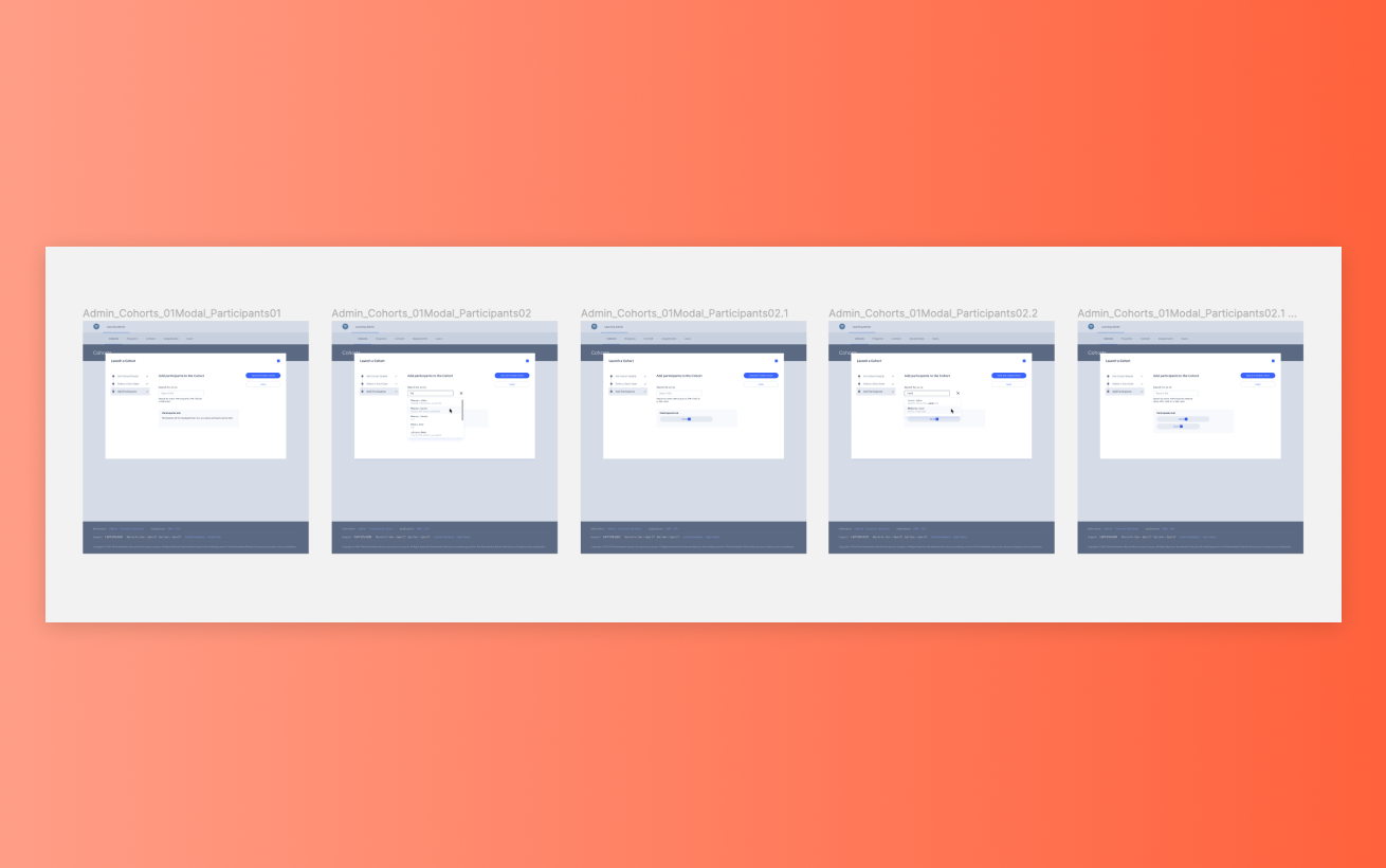
  • Story-telling Skills: UX is a field of crafting and presenting stories. I want someone who can articulate an intriguing story. An easy start is your portfolio. It’s probably pretty light, but walk in and tell me a story about your most recent project. Show me some pictures without a million words on the slide. What excited you about it? How did you connect with it? What was unexpected about it? What did you learn along the way? What do you wish you could do differently?

  • Positivity: No Debbie-Downers allowed. It’s not always going to be rainbows, unicorns, and pots of gold. I look for positive energy. How do you deal with stressful situations?

  • Culture-fit: No (normal) manager likes laying off individuals, so I take extra care in assessing how I see a potential candidate fitting into my team. Individuals have different working-styles, exhibit unique personalities, embody different work-life balance requirements–and that’s cool. But when we have to find someone to fit into an existing team, we want to make sure the fit is mutually beneficial.


4. What about my portfolio? I don’t have much to show.

Even if you only have a single project from a past General Assembly course or a past job, this is the perfect pace to start. Your work is only as strong as the story you tell with it. Use your work and process to guide whatever you create–maybe it’s a deck of slides or maybe it’s a website. Take me on an emotional and engaging journey through your UX process, however this comes to life. Some things to think about:

  • What problem you were looking to solve (and why)?

  • How did you personally/empathetically connect to this project?

  • What type of research did you conduct (and why)? What did it tell you? What decisions did you make based on this research?

  • What types of deliverables did you create over the course of the project? What did they inform?

  • What problems did you run into and how did you solve them?

  • What would you go back and do differently if could?

  • What is the 1 thing you will take as a learning into your next project?

I’m typically not as concerned with how beautiful and shiny it looks, but I am concerned with your articulation. Don’t just show a wireframe and expect your reviewer to be engaged. This is the “YOU” show, so make sure YOU know your stuff.

Inevitably, we don’t expect to see a full-blown 60-slide pitch deck, but we want to hear your story (see how this ties back to one of the qualities I look for?). Consider starting with a story of why/how you got into the UX field. When I graduated college, there was no UX degree, so my colleagues and I all came from different backgrounds. Each of us can articulate a beautiful and engaging story about how we landed in the UX industry. I look for passion, entertainment, and your emotional connection–a story that keeps me on the edge of my chair wanting to hear more and sad when it ends.

1 Comment

UX Knowledge Share: Sitemaps

Comment

UX Knowledge Share: Sitemaps

Sitemaps–a deliverable no large-scale digital web project should ever neglect, but yet, something that clients have a difficult time understanding the need for or proper use of. 

I have been lucky enough to spend the last year working on one of my favorite projects ever–a massive digital transformation of ConEd.com–taking the tired looking site from 1999 to 2017 (and beyond). After audience research, content audits, competitive analysis, and gathering insights from web analytics, my team was able to structure an extensive 10+ page document that would become the foundation of the new website. But why did we build this ginormous sitemap?

Initially sitemaps are excellent tools to:

  1. Confirm content prioritization and content organization make sense to actual users. (Is it easy for users to find the content they need to access? Is the terminology used natural to users? Is the point from A to B cumbersome?) 
  2. Align everyone on the future state of site content–new and existing. (Are all stakeholders on-board with the proposed structure?)
  3. Mapping pages to content copy decks (there should be no missing pieces/decks at the end of this)
  4. Avoid content duplication. (Duplicating content is bad practice. Don't do it.)
  5. Establish a flexible design (Make sure the architecture is scalable to accommodate new content over time). 
Sitemap

Sitemap

So, we had a sitemap and built a website. End of story. WRONG! We couldn't just hand the clients a document and expect them to know what to do with it. In order to give the clients the confidence in applying the`same thinking to maintain a consistent website structure going forward, we needed to provide them the logic behind our work.

To transfer our knowledge, I structured a 3-step presentation (with an interactive exercise at the end). Below is my handoff approach that can help you build your customer's confidence in maintaining their new shiny sitemap.

How to structure a sitemap knowledge share presentation

  1. WHAT
    What key information did you start with? Taking into consideration that not everyone at the presentation will have been part of everything done over the course of the project, everyone should understand, on a high level, the breadth of strategic research, the customer and stakeholder interviews, the site goals and guidelines, and the analytics and user testing. 
  2. WHY
    Using the aggregated research, why was the sitemap structured in a specific way? This is where you define the insights–what did you learn from the research that played into decisions on the sitemap? For us, we learned through customer interviews that account transactions (ie. paying a bill or starting/stopping service) were some of the primary goals of users on the site, so we needed to prioritize pathways to key actions. Through customer card sorting exercises, we learned that the VOC (voice of the customer) was important in helping users understand what specific content was. Based on user testing, we found many customers searching for content as a specific type of customer (ie. business vs. residential customer) and because of this, we segmented relevant content based on user type.
  3. HOW
    With a final sitemap structure defined, how can you maintain a consistent sitemap structure going forward? To help our clients, I defined several key questions for them to ask themselves when a new piece of content shows up on their desk. The derived questions could guide them through the thought process to access a proper places that would make sense to customers and also build on the structure we had defined. Some of our questions included:
    • Is this placement in-line with our guiding site principles?
    • What is the audience for this piece of content and does this placement work for those users?
    • Is this easily find-able for the target user?
    • Is this placement consistent?
  4. GROUP EXERCISE: I DO, WE DO, YOU DO
    "I do, we do, you do" s a learning method of talking participants through a new concept, showing them how to do it, and then having them do it on their own. Research confirms this is an effective learning process. I started with a new hypothetical piece of content and talked through my reasoning of where I would put it in the sitemap and why (referencing the research and insights we surfaced). After doing another example together as a group, individual attendees took turns taking pieces of content and talking through where they would place it. Though there may be some struggles, this is a good method to allow participants to apply their learning.
I do, we do, you do: Group Exercise

I do, we do, you do: Group Exercise

In the long run, sitemaps are great tools for:

  1. Maintaining website consistency (making sure that categories/sections don't become dumping grounds for random pieces of content)
  2. Managing content ownership (for larger organizations where content is dispersed across teams, this is a place where ownership of content can be displayed)
  3. Prioritizing content (this continues to be of importance after launch as a site's content grows, items may need to be de-prioritized or re-prioritized)

Comment

Building an Integrated Translation Experience

Comment

Building an Integrated Translation Experience

UX Challenge: Our new website build must incorporate 2 human translated languages (English and Spanish) along with a Google translation widget to accommodate other languages from our target personas. 


Step 1: Research / Discovery

Because the client had previously been using the Google Translation widget, they wanted proceed with incorporating the same module. Our technical research on the widget was able to highlight:

Google_Translate.png


Negatives (*cue tiny violin*)

  1. Minimal customization of widget appearance
    • Elements you can customize: font, background, languages and dropdown icon 
  2. Language drop down is non-responsive 
    • Language options are not all viewable unless the browser width is 1050px+, causing display issues on smaller devices and screens

Positives

  1. Free Free Free!
  2. Offers a multitude of languages 
    • In the interim of having professionally translated pages of content, the module gives customers the ability to get a general understanding


Step 2: Build & Test

Solution 1

My first proposed solution positioned the two language tools apart from each other. We feared positioning them together would correlate them as the same thing and we didn't want the un-perfect Google translations to be confused with a professional translation of content. With a minor hack work-around, the tired looking Google Translate widget was placed behind a prettier looking "Google Translate" button click. This gave us the flexibility to tie the visual style into our new brand look and feel. [Google does not offer that feature in its stand alone widget.]

After some initial testing, most users found the translations were the same "feature" and should be combined, regardless if they were imperfect.


SOLUTION 2 

Refining my previous solution based on user feedback, I proposed we integrate all the languages into the utility bar. The "Google Translate" terminology was adjusted to "Other Languages" to feel more cohesive with the other options. With a more consistent and integrated approach, customers found this more intuitive and convenient.  (See screens of the revised experience below.)

Based on our research and testing, the client approved our second solution approach. (This will be pushed live with the next code update on ConEd.com)

Because of the widget's technical limitations, there are still the some draw-backs, but conducting some lo-fi prototypes and talking to customers about them, helped us build an approach that fit the expectations and needs of the customers. #win


Comment

Working Together, Half a World Apart

Comment

Working Together, Half a World Apart

The past 2.5 months working out of New York City with a team based in Singapore has felt like a test for me. A test to see how early I can wake up, on a daily basis, and be coherent enough to start a scrum meeting. At this point, I'm pretty confident I'm running a passing grade on that test–but dang, 6am is legit early for this New Yorker.

But this project has also brought on challenges working with a UX team that not only resides on a different continent, many many time zones away, but working with a client that resides in a completely different location than us both.

Here are two challenges we've worked through and some of my personal takeaways:


UX Challenge 1:
How could our UX team best collaborate on creating a best in class product experience given our opposite time zones.

Our approach:
My UX colleague in Singapore and I started by setting up a daily schedule were we would adjusted our working hours in a way where we could overlap 2-3 hours of our day. While this obviously created working hours there were a bit uncharacteristic for our profession (me 6am-3pm, and my colleague 12pm-8pm), it was practical given our situation. Most days we spent our overlap hours on Skype calls and video sketching sessions, white boarding, and post-it-noting. We worked through complex user flows, content categorization, and user stories live on a Google-drive document. Each of us would populate our ideas while discussing our rationale, and then we'd move items around. In many ways it was almost like working together in person, at the same table, except most days I worked in my pajamas.

Down & dirty UX sketch video session

Down & dirty UX sketch video session

My Takeaways:

  1. Many hours apart, technology was the key that helped us bridge a communication gap, and aided in the facilitation of a more collaborative working environment that seemingly only 20 years ago may never have been possible (or just way to expensive to even consider). Regardless of whether we were in the same city or half a world away, real-time tools (Skype, GoogleDrive, etc.) helped us quickly convey thoughts without having to save a 25mb file and send it via email, only for it to get stuck in an outbox. GoogleDrive has since become my tool of choice for a lot of UX-related tasks–planning/estimating, aggregating research, writing findings reports, building sitemaps, and even storing folders worth of sketches–basically anything that I need to access wherever/whenever with whoever. This cloud thing is doing wonders for my ux work.
     
  2. I never considered the obscene number of distractions a regular office environment could produce–coffee breaks, meetings, puppy play time, meetings, client pop-ins, meetings, birthday events, meetings, lunch and learns, and obviously MORE MEETINGS. Having working hours where the majority of the team was sleeping made my day, for the most part, 100% uninterrupted work time. I found I could complete tasks faster and more efficiently with less interruptions. And, this also made my daily morning scrums and team calls that much more focused. Win/Win. 


UX Challenge 2:
How does our UX team most efficiently convey our complex design concepts to a client we would not have to opportunity to see or work with in person.

Our approach:
After working with the same client last year, we knew it would be key to sell our well-thought out experience vision to the client. With 8 sprints set up to manage the various areas of the product, we utilized each of those sprints to set up a focused presentation with the client. Much of our work had been done behind the scenes–researching, thinking, validating–and we struggled a bit to find a way to condense 3-4 weeks worth of information into a single 1 hour presentation. We decided on a hybrid presentation approach. We would first set the stage with a few slides that brought the client up speed on our progress (in the grand scheme of the project), what we were presenting in the review (to get their blessings on), and the next steps for everyone involved. Outside of that, my colleague and I utilized many of the sketches we created in our sessions and stitched them together using the prototyping software, Axure. We wanted to use this as our presentation tool, to walk the client through our visualized structure and as well as use it to key in on why we proposed specific experiences.

My home office before a client video presentation–design zen.

My home office before a client video presentation–design zen.

My Takeaways:

  1. Don't be afraid to fail or do it wrong the first time. Our first attempt at presenting our UX via interactive sketches turned out to be a bit difficult for engineers and our very technical audience to comprehend. But, that was, in theory, great. We learned something about our audience! They wanted something more tangible. They wanted to see real content they already had populated in our work. This learning would guide our next presentation. 
     
  2. Sometimes what you think may be the most efficient way of working turns out to be less efficient than imagined. Sketching is fast–down and dirty and not really super focused in on the details, but rather the core concept. That's great for communicating quickly, but having to scan sketches in, resize them, link them up in a prototype all to learn that you forgot a key item in the experience can really slow you down. We were on a limited time frame and to make small text edits and rearrange items in sketches became much more difficult than it would have been had we simply built our concepts out in Axure to begin with. 


And those takeaways are why I love what I do. No two projects are the same. No two clients, teams, offices, or tools are the same. It's really an act of progressive learning. We take our best stab given our past knowledge, current situation, and team structures with the understanding that we will have to be agile–always learning and adjusting appropriately. So, cheers to new experiences, whether in the same city, or half a world away.

Comment

Connecting with the World

Comment

Connecting with the World

Sometimes life just gets in the way. We find ourselves buried in work emails/Slack notifications/Google hangouts, or racing around making last minute dinner arrangements at a new local restaurant, or researching our next big vacation to South America (making sure we don't end up in the un-fun area of town), or perhaps just searching for a magical dancing honey badger...but anyways...he don't care.

Wherever I am in the world, amid the chaos of my daily routine, I find it important to take a minute to pause and take in the surrounding environment. There is inspirational beauty surrounding all of us, we just have to be open to seeing it.

The following are a few of my favorite daily moments.

Nashville, Tennessee

Nashville, Tennessee

New York, New York

New York, New York

Singapore

Singapore

Comment

Looking Down in Singapore (Free Wallpapers)

Comment

Looking Down in Singapore (Free Wallpapers)

What happens when you combine a whole bunch of cultures on a small island? Singapore happens.

A 24 hour flight traveling 9,500 miles from home, Singapore was an adventure like none other. The eclectic food scene, street fairs, art centers, and in-door everything were a refreshing cultural perspective–one that didn't fail to spark a creative fire.

So, when I returned to NYC, I said "can lah" to sharing a few of my favorite artistic street photos. These photos are a few in a series I put together in response to may who told me "Don't forget to look up" during my travels. Looking up is lovely, but we can't forget to LOOK DOWN or we'll miss some beautiful art right beneath our feet.

Enjoy, share, and find more in my series on Instagram at #GlobalSteps

You can download the hi-resolution version of all of these photos FREE for personal use (great for desktop wallpaper!). 


Comment