I recently worked with tech company to build out a new online trading platform. The company set a tight product deadline and we were hustling to manage our personal deadlines as well as department deadlines. In my past experience experience with project managers, most default to one of a variety of online software tools to manage projects and associated tasks (think Basecamp, JIRA, Trello, etc.). But without a "project manager" here, I still wanted a transparent way to view where the UX & design team were in our project completion–what items were not yet started, in progress, or completed.
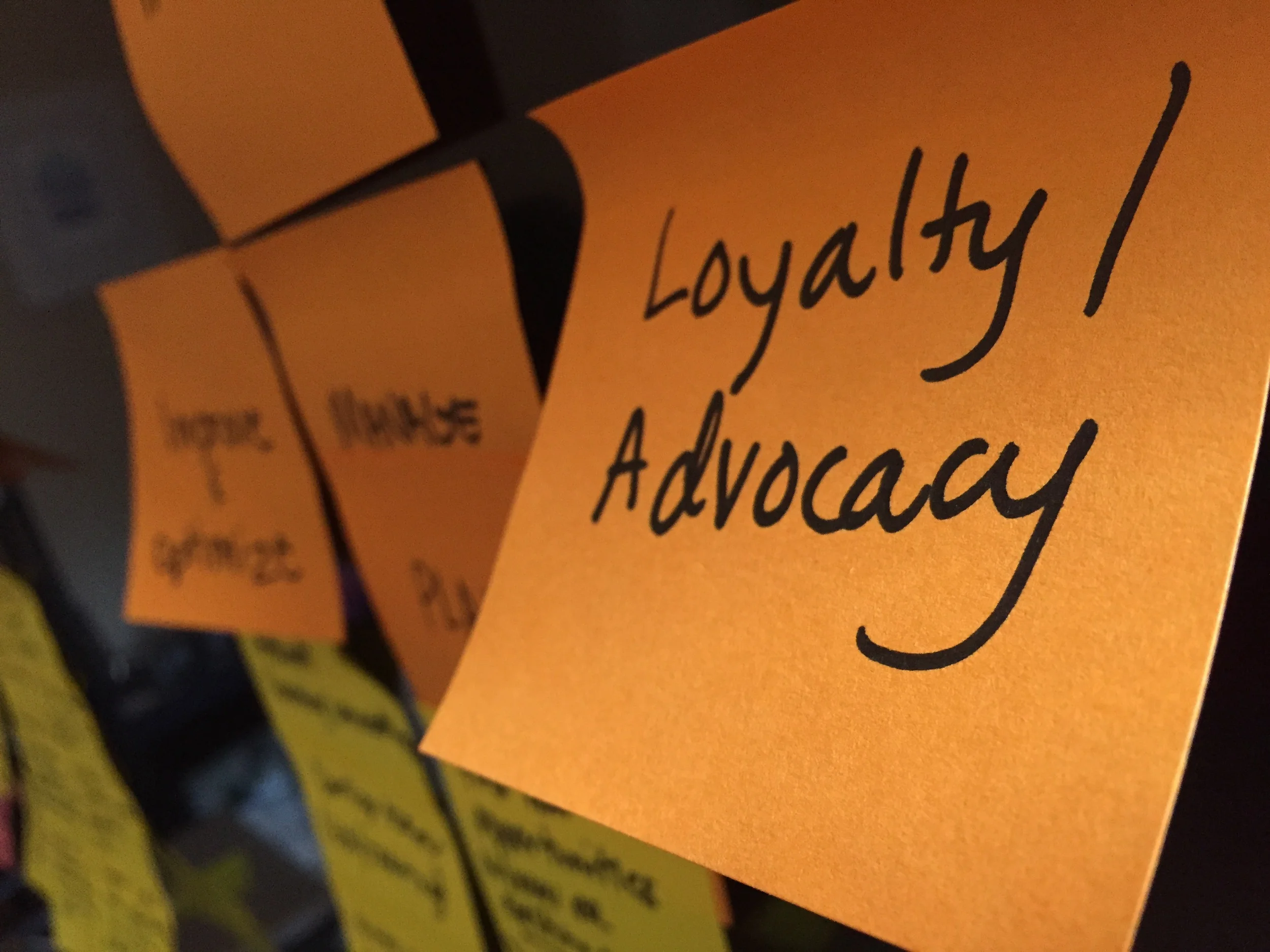
My UX team decided to adopt an empty whiteboard to post our team's tasks on–using different colored post-it notes to denote different types of tasks. All team members were responsible for managing their own tasks and moving them to the correct category when they started or completed them. It was a great visual indicator for everyone involved to see the progress we were making without having to open another tab in our browser or log it in another new software management system.
Soon after we began our task board, engineering decided to adapt the whiteboard to include their team's tasks as well. Everyone found something very satisfying about using a lo-fidelity, tactile method of writing down items and moving them across the board.
While I LOVE my digital cloud applications, collaboration doesn't always have to happen in a digital format. And, in this case, it was a refreshing experiment that took us back to an age before computer-based project management. We were constantly reminded, by this huge physical board, of our end goal. And we made it.
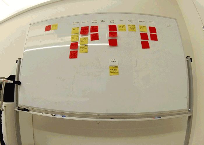
The progress of our task management board. We even included a "key" so non-participants had full transparency into our process and progress.